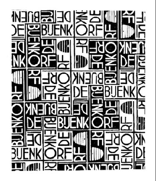
drawing, graphic-art, paper, typography, ink
#
drawing
#
graphic-art
#
contemporary
#
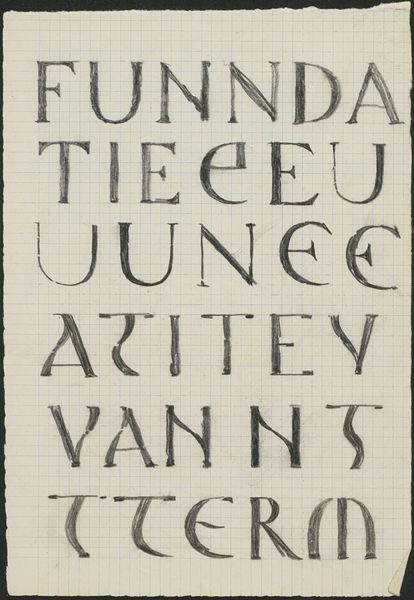
hand-lettering
#
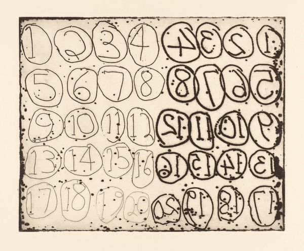
lettering
#
small typography
#
playful lettering
#
hand drawn type
#
hand lettering
#
paper
#
typography
#
ink
#
hand-drawn typeface
#
geometric
#
typography style
#
line
#
handwritten font
#
small lettering
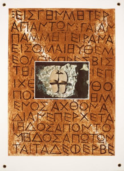
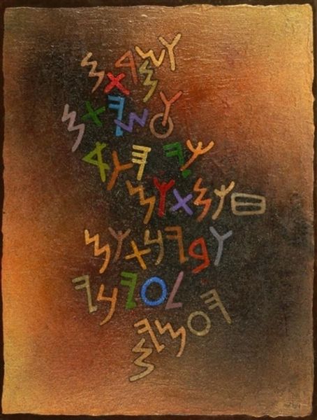
Copyright: Alevtyna Kakhidze,Fair Use
Editor: This is Alevtyna Kakhidze's "Untitled," created in 2022 using ink on paper. The piece features bold lettering with some quirky, hand-drawn illustrations. I am immediately drawn to its graphic simplicity. How do you interpret this work from a formal perspective? Curator: Considering its formal qualities, one must recognize how Kakhidze utilizes the stark contrast of black ink against the white paper. This enhances the legibility and impact of the text. What structural relationships do you observe between the different lines of text? Editor: I notice the text varies in size and style, almost like different voices contributing to a single message. The geometric forms and playful lettering seem to contrast each other. Curator: Precisely. Note also how the varying line weights and the strategic placement of the small illustrations contribute to a visual rhythm. Semiotically, the choice of typography becomes critical. How does the handwritten font affect its reception compared to, say, a standard typeface? Editor: It gives it a personal and informal touch, as if it's a handwritten note, making the message feel more intimate. I wonder what exactly that message is. Curator: Let us concentrate on the intrinsic formal organization. Consider the composition itself as the primary communicator of meaning. The imperfections inherent in the hand-drawn elements suggest the presence of the artist and their choices. What might these forms tell us beyond their semantic content? Editor: I see now. Focusing on form over explicit meaning makes me appreciate the subtle details, the intentional imperfections in the lettering. Thank you. Curator: Indeed. It underscores the capacity of visual elements, absent overt narrative, to evoke feeling and intrigue.
Comments
No comments
Be the first to comment and join the conversation on the ultimate creative platform.
More like this