graphic-art, typography
#
art-deco
#
graphic-art
#
random pattern
#
repeated pattern
#
pattern
#
op art
#
text
#
typography
#
repetitive shape and pattern
#
rectangle
#
geometric
#
sketch
#
vertical pattern
#
line
#
pattern repetition
#
layered pattern
#
funky pattern
#
combined pattern
#
repetitive pattern
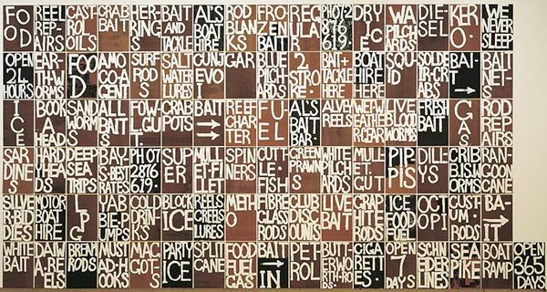
Copyright: M.C. Escher,Fair Use
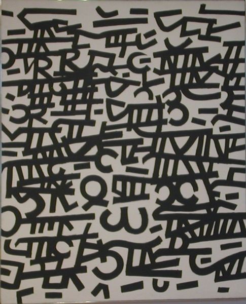
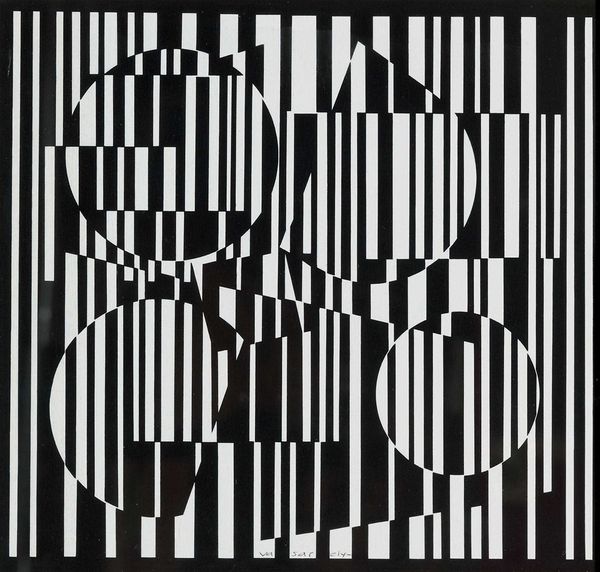
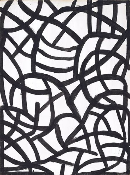
This wrapping paper design was made by M.C. Escher; its a simple, graphic black and white print. The letters are fragmented, but you can still make out the words. Its construction is all about process, about how the artist moves between representation and abstraction. I’m struck by the letters themselves; they're like building blocks, creating a visual rhythm that's both playful and systematic. Escher repeats and inverts the letters. They become shapes and patterns in themselves, like an alphabet soup. It’s this tension, this push and pull between legibility and pure form, that makes the piece so compelling. Escher’s optical illusions share that dance between the conceptual and the tangible. Design for Wrapping-paper: De Bijenkorf reminds me of some of the pattern work by artists involved in the Memphis Group, or maybe even some of the more graphic work of someone like Bridget Riley, though Escher gets there first, playing with perception and the joy of repetitive forms.
Comments
No comments
Be the first to comment and join the conversation on the ultimate creative platform.
