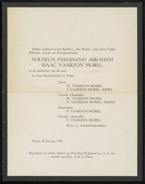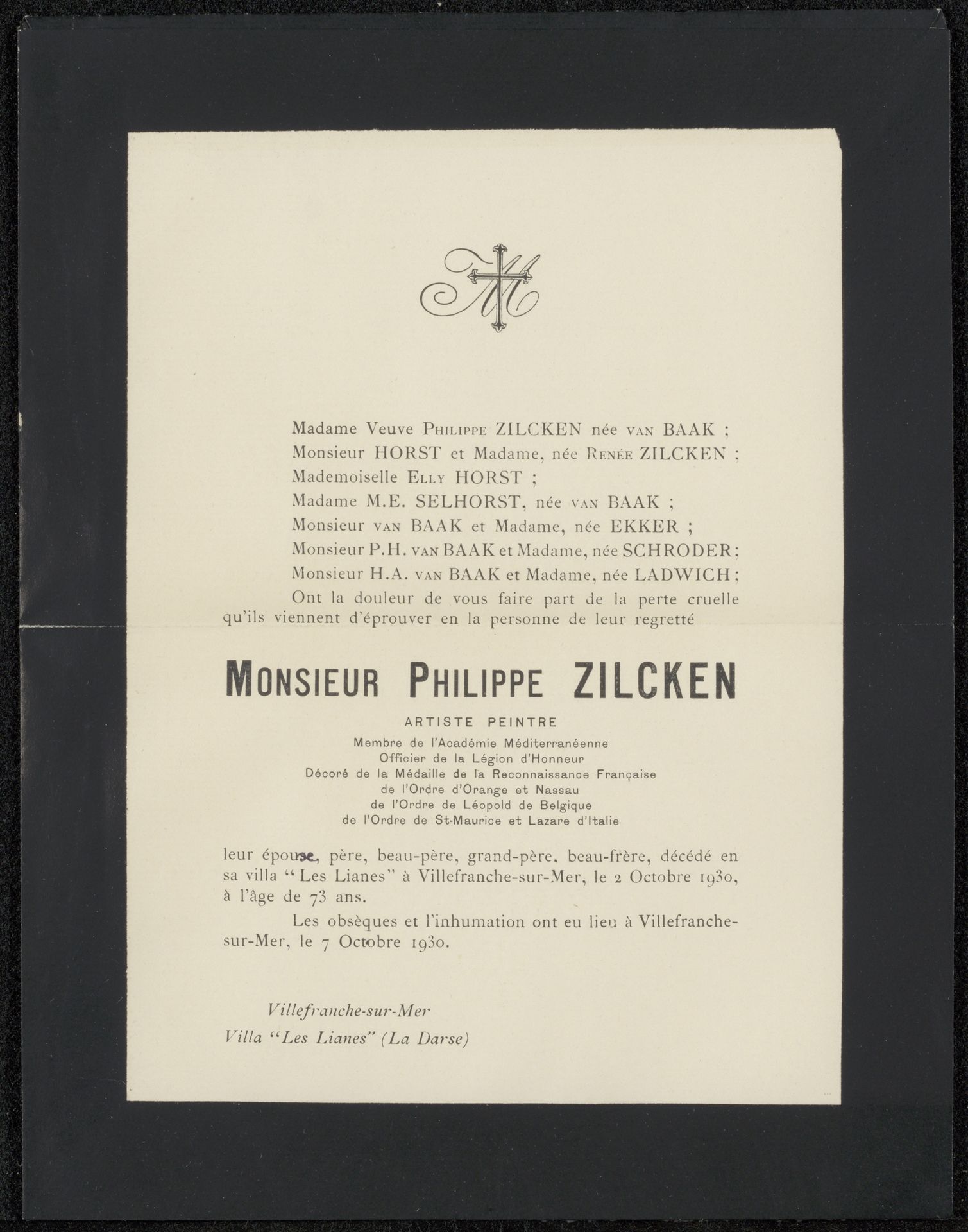
Possibly 1930
Overlijdensbericht uit archief Philip Zilcken
Listen to curator's interpretation
Curatorial notes
This is a funeral announcement for Monsieur Philippe Zilcken, made in 1930, by Henriette Wilhelmina van Baak. It’s all monochrome, black ink on a creamy paper, a high contrast combination that feels both classic and solemn. Looking closely, I notice the printed text is crisp, but the layout has an interesting asymmetry. See how the weight of the text sits heavier on the left, balanced by that elegant, stylized initial on the right? It’s these subtle choices that create a feeling. The details, like the varied fonts and the way the lines of text are spaced, reveal a real attention to detail, and feel very personal, despite being printed. This piece reminds me of the work of Corita Kent, who used the medium of printmaking to create bold and colourful designs that combine text and image. Like Kent, Van Baak uses the medium of print to communicate a message with clarity and impact, reminding us that art can be found even in the most unexpected places.