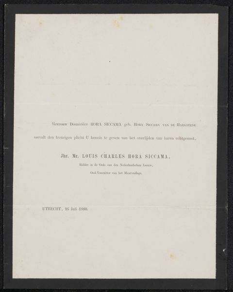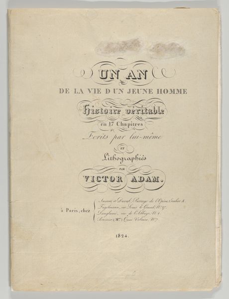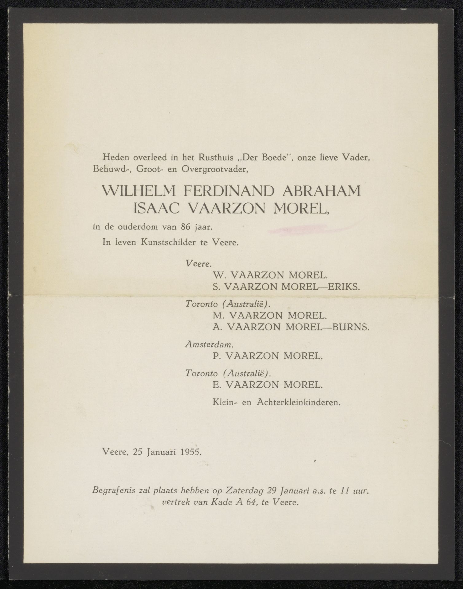
Possibly 1955
Overlijdensbericht betreffende Willem Vaarzon Morel
Listen to curator's interpretation
Curatorial notes
This obituary, made in 1955, announces the death of Willem Vaarzon Morel, who was a painter from Veere. What strikes me is the straightforwardness of it all, a clean sans-serif typeface, meticulously aligned on the page. There is a kind of raw, unadorned quality here, where the function is all. The texture of the paper seems almost palpable, as if you could reach out and feel its slight imperfections. I love the way the ink sits just so on the page, each letter carefully placed to deliver its message. It reminds me that art isn't always about grand gestures or elaborate displays. Sometimes, it's about the simple act of communication. This piece whispers of the artist's life, hinting at a wider body of work through a focus on something else entirely, a passing. For me, the graphic simplicity of this piece evokes the work of someone like Agnes Martin, in its quiet, understated beauty. It’s a reminder that beauty can be found in the most unexpected places, even in an obituary.