drawing, print, paper, typography
#
drawing
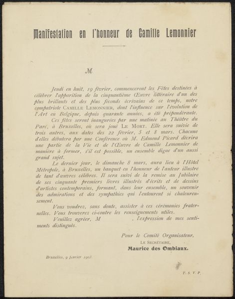
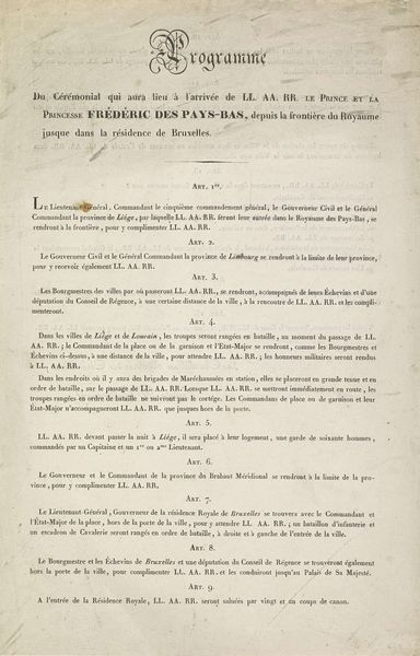
# print
#
paper
#
typography
Copyright: Rijks Museum: Open Domain
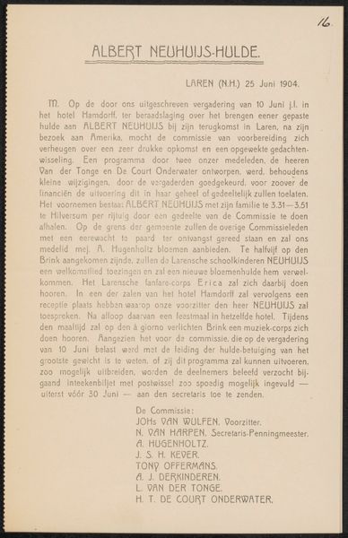
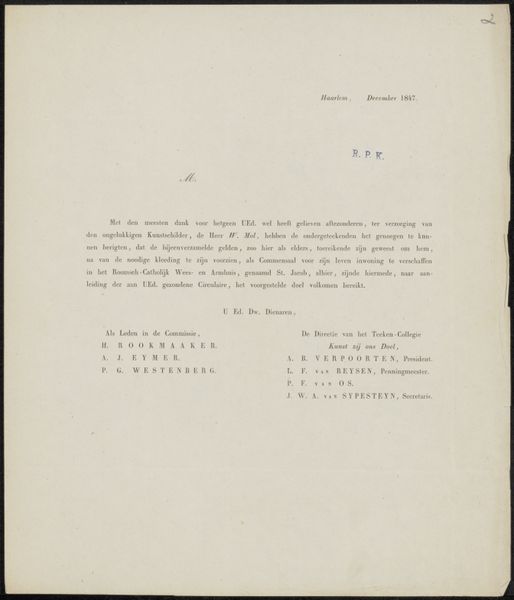
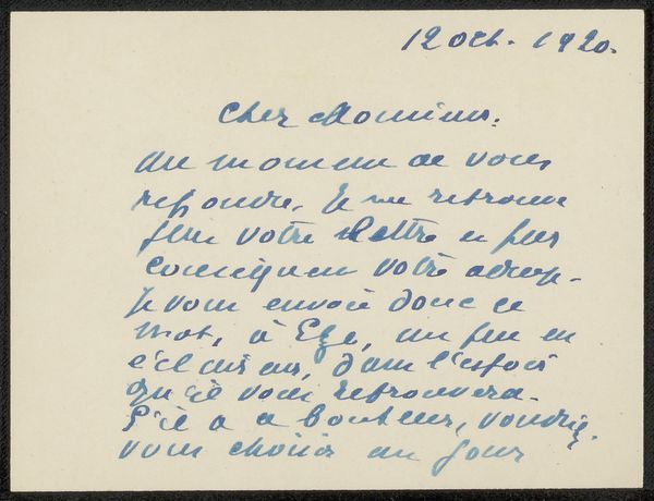
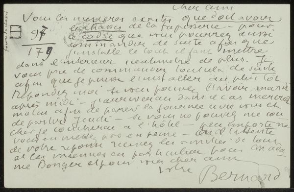
Editor: This is “Brief aan Johannes Bosboom,” dating from 1827 to 1891, housed at the Rijksmuseum. It’s a print, typography on paper. What strikes me is the clear, almost bureaucratic layout, yet knowing it's linked to an art society... How do you see it? Curator: The materiality speaks volumes. The very act of printing – typography on paper – signals a desire for dissemination, for making ideas and regulations accessible. We have to ask, what social purpose did these printed documents serve within Arti et Amicitiae? Editor: So you’re focusing on its role within the art society, less about its aesthetic value? Curator: Precisely. Forget about the artistic touch for a moment. This document shows a system of artistic exchange mediated through bureaucratic structures, fees, and memberships. We might examine the ink, paper quality, the labour involved in printing: who was commissioned, how were they paid? Were these accessible means of information to many or very few, at the time? Editor: It’s like examining the scaffolding of the art world, rather than the finished artwork itself. Curator: Yes, the 'means of production,' in this case a physical printed object, reveals the economics underpinning artistic practice. Even this ‘letter’ implies consumption: of art, of membership, of a particular lifestyle. Editor: I hadn't considered that printing, the choice of materials, was also part of this organization's identity. I see that analyzing art isn’t always about visual impressions. Curator: Exactly. The seemingly mundane details of this print invite us to consider who was involved, who had access, and who benefitted within the artistic community of the time. What at first looked like a simple document actually reflects a whole network of relationships, transactions, and power dynamics, all anchored in these physical materials.
Comments
No comments
Be the first to comment and join the conversation on the ultimate creative platform.
More like this