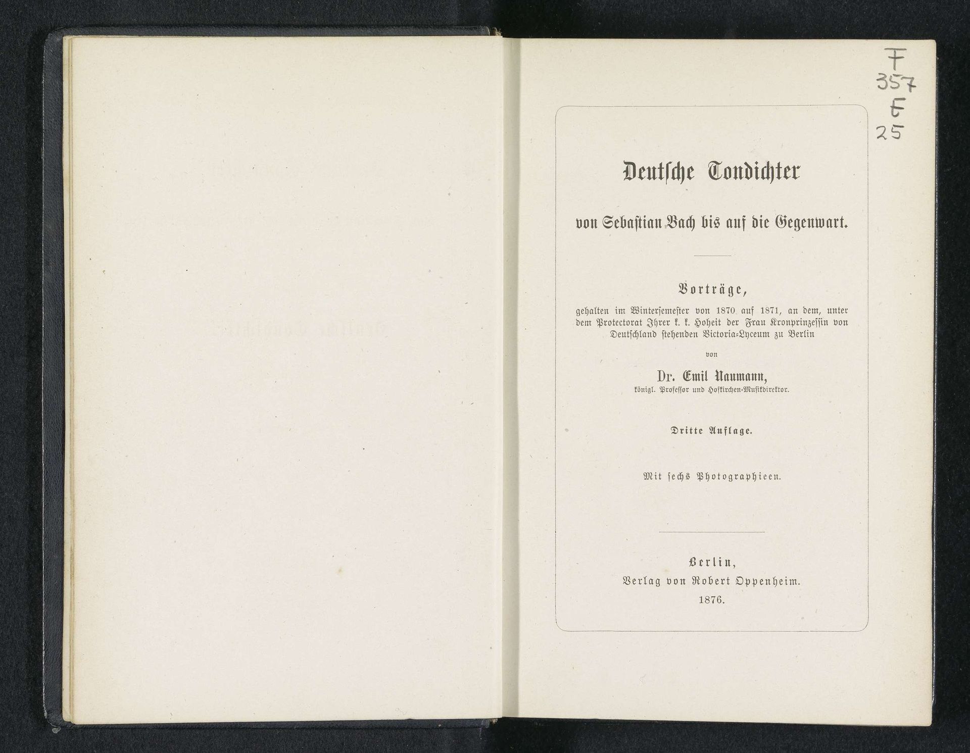
1876
Deutsche Tondichter von Sebastian Bach bis auf die Gegenwart
Listen to curator's interpretation
Curatorial notes
This is the title page of Emil Naumann's "Deutsche Tondichter von Sebastian Bach bis auf die Gegenwart", published in 1876. The composition is strikingly formal. We see a book opened to reveal two pages, the left blank, and the right filled with text. The layout is classical in its symmetry, the black typeface carefully arranged within a rectangular frame. The contrasting negative space creates a visual hierarchy, drawing our eye to the book's title and author. Structurally, the book signifies a container of knowledge, where the arrangement of text represents an ordered system of thought. This structural clarity is characteristic of 19th-century academic publications, reflecting a desire to categorize and present information in a precise and accessible manner. Here, the book's physical form and the typographic arrangement speak to the era's ideals of rationalism and systematization. The book invites us to decode its layers of meaning within the historical and cultural context of 19th-century Germany. The formal arrangement highlights the era's commitment to order, clarity, and the structured presentation of knowledge.