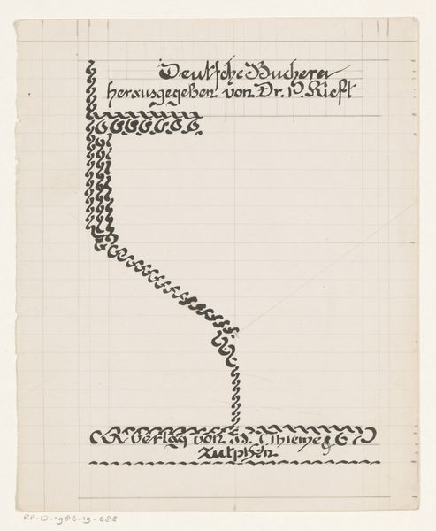
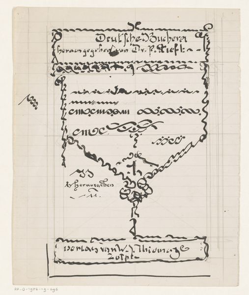
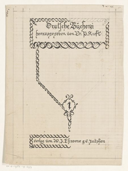
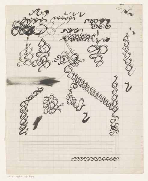
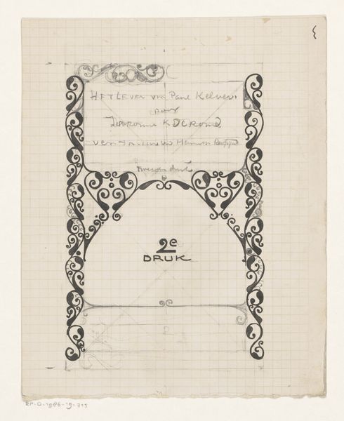
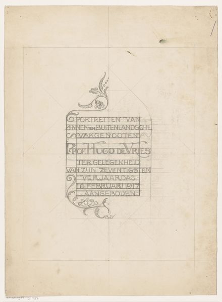
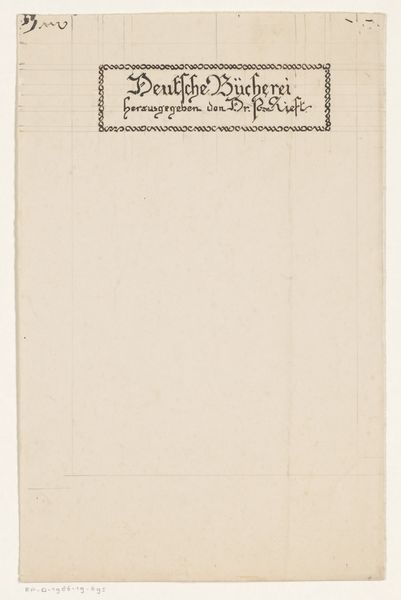
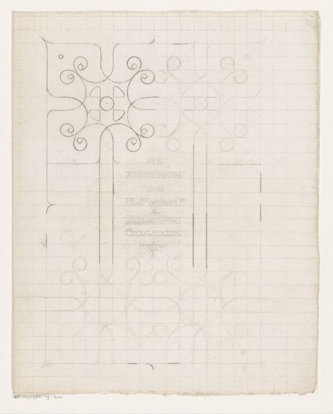
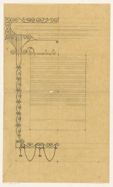
Bandontwerp voor een boek gepubliceerd door dr. P. Kieft 1884 - 1952
0:00
0:00
drawing, graphic-art, paper, typography, ink
#
drawing
#
graphic-art
#
narrative-art
#
paper
#
typography
#
ink
#
geometric
#
line
#
modernism
Dimensions: height 215 mm, width 162 mm
Copyright: Rijks Museum: Open Domain
Curator: Here we have Reinier Willem Petrus de Vries' "Bandontwerp voor een boek gepubliceerd door dr. P. Kieft," created sometime between 1884 and 1952. It’s a striking book design. Editor: It’s certainly stark. My immediate impression is that it feels incredibly formal and rigid. All those lines, the tight typography... what’s your take? Curator: It is very precise. This was a time of burgeoning nationalism and a search for cultural identity in many European nations. This book design, commissioned for Dr. Kieft, a figure no doubt involved in intellectual circles, places itself within a specific historical context and evokes certain political sensibilities that favored uniformity, strength, and national character. Editor: You can see the careful construction—the interplay of linear elements and geometric forms. It feels very deliberate. Consider the chain-like ornamentation connecting the top and bottom texts; it uses repetition to create rhythm, drawing your eye down the page. Curator: Absolutely, and this careful articulation of forms reflects a desire to present not just information, but a statement of cultural intent. Look at the typography itself; the font choice is significant, imbuing a sense of traditional, perhaps even idealized, German identity through its design and utilization on the cover of a scholarly work by Dr. P. Kieft. It tells a specific kind of story. Editor: I find it fascinating how the artist uses the starkness of ink on paper to create depth. Notice the variation in line weight in some of the script work which indicates planes. The layout has a definite visual hierarchy established through position and line design. It creates an intriguing interplay between text and ornamentation. Curator: Right. Considering this piece was created during a time of considerable sociopolitical upheaval, it is reasonable to interpret it as more than just a design. It’s a cultural artifact, expressing national pride that aligns itself in support of authoritarian and traditional political positions during the early part of the twentieth century. Editor: Perhaps that starkness you initially noted wasn't an accident. This rigorous formalism definitely gives one plenty to consider in terms of aesthetics and layout structure. Curator: Precisely, thinking about art in the broader context allows us to see how cultural and personal views shape not just what we say, but how we present it.
Comments
No comments
Be the first to comment and join the conversation on the ultimate creative platform.
More like this