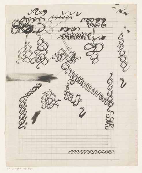
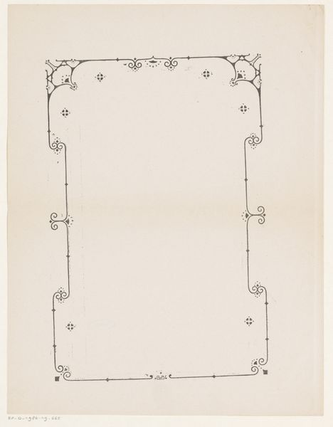
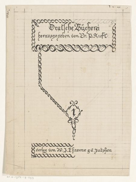
Bandontwerp voor een boek gepubliceerd door dr. P. Kieft 1884 - 1952
0:00
0:00
drawing, graphic-art, paper, typography, ink
#
drawing
#
graphic-art
#
paper
#
typography
#
ink
#
geometric
#
line
Dimensions: height 203 mm, width 165 mm
Copyright: Rijks Museum: Open Domain
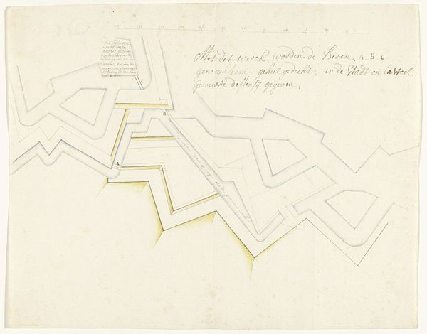
Editor: So, this is Reinier Willem Petrus de Vries' "Bandontwerp voor een boek gepubliceerd door dr. P. Kieft," likely created sometime between 1884 and 1952. It's ink on paper, a book cover design, but it feels almost like an architectural blueprint, doesn't it? How would you interpret the drawing? Curator: The grid of the paper itself is fascinating; it foregrounds the labor of creation. The meticulous, almost engineered quality of the typography also hints at mass production techniques creeping into book design. What sort of readership was the 'Deutsche Bucherei' intended to attract? Knowing this would reveal something of the consumption this image was geared toward. Editor: That’s interesting; I hadn't considered the grid as being a part of the artwork in that sense. Is there something significant in using ink as the primary medium? Curator: Ink is critical because it's easily reproducible, central to both artistic drawing and industrial printing processes. It becomes a nexus, blurring the boundaries between original artistic creation and the multiple, the crafted and the mass produced. Consider the context— were design drawings typically considered 'art' or a means to an end at this time? Editor: I see what you mean! So, by highlighting the material and process, this piece prompts us to reconsider how we value labor and production in art versus other industries. Thanks! Curator: Exactly! It compels us to question traditional hierarchies within art and craft production. It makes you wonder how something functional such as a book design could actually be elevated as its own artform.
Comments
No comments
Be the first to comment and join the conversation on the ultimate creative platform.
More like this