1884 - 1952
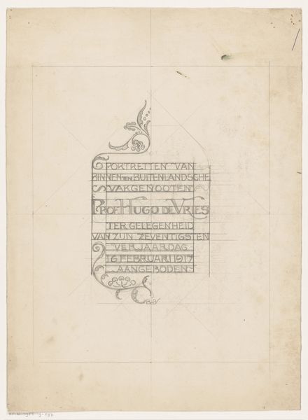
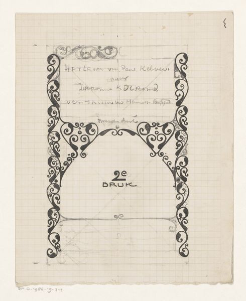
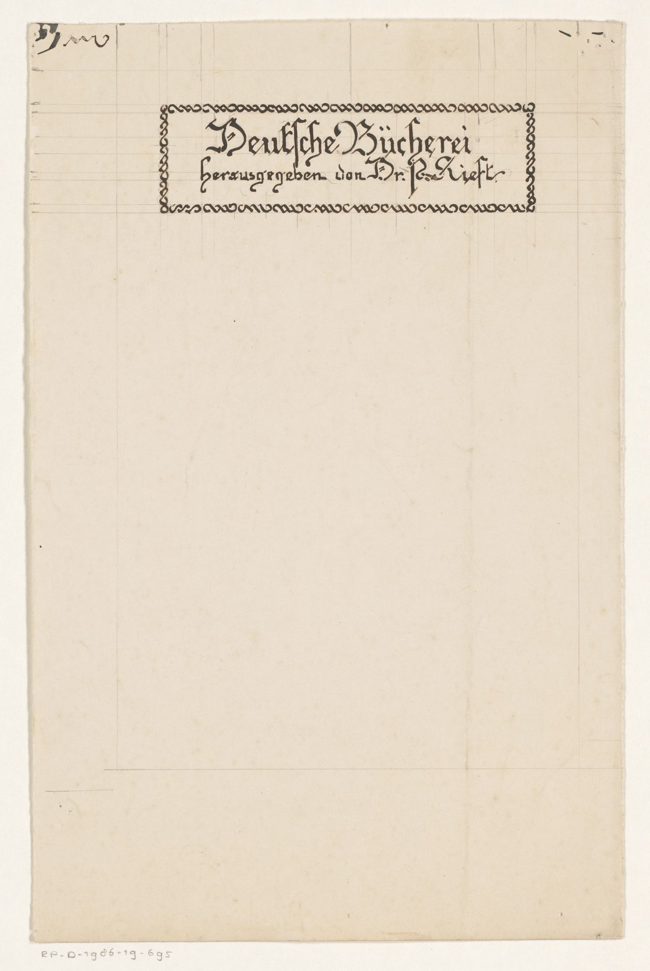
Bandontwerp voor een boek gepubliceerd door dr. P. Kieft
Listen to curator's interpretation
Curatorial notes
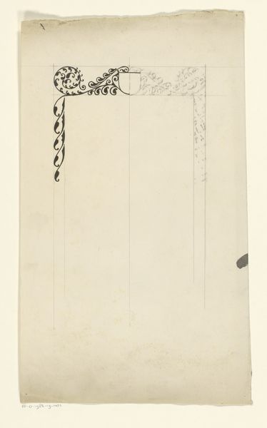
This is a book cover design by Reinier Willem Petrus de Vries. It’s all about lines, not colors, that make it tick. It's as though the whole thing starts with a thought process, a feeling, that the artist then tries to wrangle into a structure. Take a look at the lettering, for example. It's like each letter is a little experiment, a tiny drawing trying to find its form. And the frame! It is like a collection of tiny pearls. The lines are not perfectly neat, which gives the whole thing a lively, breathing quality, like it's still in process. The texture of the paper, too, adds to the whole vibe. It's not trying to hide its flaws. It’s interesting to compare this piece to someone like Paul Klee, who was also fascinated by the expressive potential of line. What connects them is a belief in art as a process of discovery. It leaves space for our own interpretation. Art isn't about having all the answers, but asking the right questions.