About this artwork
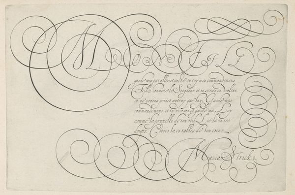
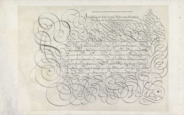
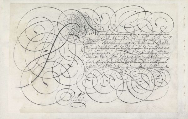
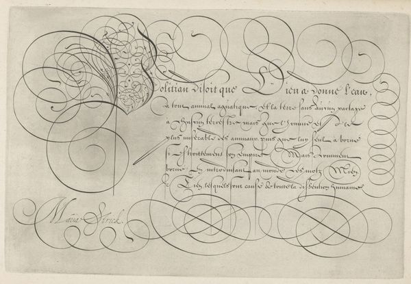
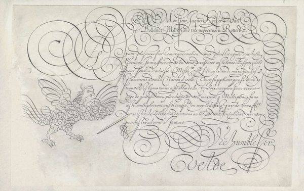
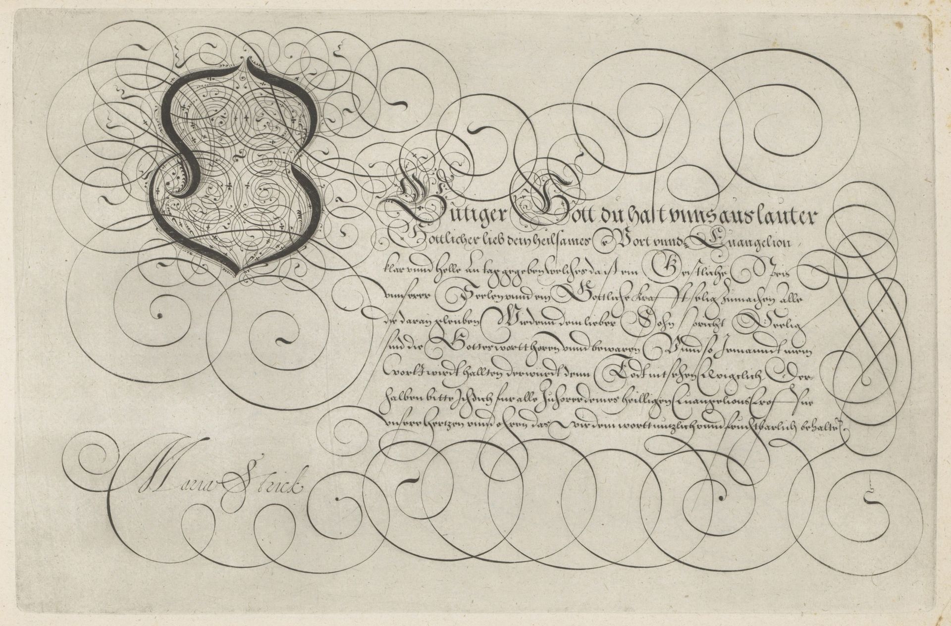
Editor: So, this pen and ink drawing, "Schrijfvoorbeeld met kapitaal O" from 1618, is by Hans Strick and it is held at the Rijksmuseum. The delicate swirling lines and densely packed text almost make it seem like a secret code. How was something like this viewed at the time, as an art form or something else entirely? Curator: It’s important to consider the social context of calligraphy at this time. Writing masters, like Hans Strick, weren’t just artists; they were educators and communicators in a society where literacy was still a valuable skill and a status marker. The beautifully rendered letters aren't simply aesthetic; they also represented the power of language, scripture, and knowledge, tightly controlled by the elite. Editor: That makes sense. The way the "O" is designed like a crest suggests that idea of power. Is it meant to signal status through religious text and artistry? Curator: Absolutely. In the 17th century, the ability to not only read and write, but to do so with such elegance, was a clear demonstration of one's social standing. This drawing operates on several levels: a display of calligraphic skill, a devotional act evidenced by the religious text, and also as a piece designed to potentially be disseminated among certain circles as part of solidifying status and piety, no? How might that public role then change how we interpret the "sketchbook" element suggested by the AI? Editor: Good point! It’s almost like he’s publicly performing his personal devotion and artistry, blurring the lines between private and public roles. Thanks for offering a new perspective! Curator: And thank you for noticing the inherent tension between its artistry and potential functionality. Food for thought about the way different layers of interpretation are always accessible.
Artwork details
- Medium
- drawing, ink, pen
- Dimensions
- height 195 mm, width 300 mm
- Location
- Rijksmuseum
- Copyright
- Rijks Museum: Open Domain
Tags
Comments
Share your thoughts
About this artwork
Editor: So, this pen and ink drawing, "Schrijfvoorbeeld met kapitaal O" from 1618, is by Hans Strick and it is held at the Rijksmuseum. The delicate swirling lines and densely packed text almost make it seem like a secret code. How was something like this viewed at the time, as an art form or something else entirely? Curator: It’s important to consider the social context of calligraphy at this time. Writing masters, like Hans Strick, weren’t just artists; they were educators and communicators in a society where literacy was still a valuable skill and a status marker. The beautifully rendered letters aren't simply aesthetic; they also represented the power of language, scripture, and knowledge, tightly controlled by the elite. Editor: That makes sense. The way the "O" is designed like a crest suggests that idea of power. Is it meant to signal status through religious text and artistry? Curator: Absolutely. In the 17th century, the ability to not only read and write, but to do so with such elegance, was a clear demonstration of one's social standing. This drawing operates on several levels: a display of calligraphic skill, a devotional act evidenced by the religious text, and also as a piece designed to potentially be disseminated among certain circles as part of solidifying status and piety, no? How might that public role then change how we interpret the "sketchbook" element suggested by the AI? Editor: Good point! It’s almost like he’s publicly performing his personal devotion and artistry, blurring the lines between private and public roles. Thanks for offering a new perspective! Curator: And thank you for noticing the inherent tension between its artistry and potential functionality. Food for thought about the way different layers of interpretation are always accessible.
Comments
Share your thoughts