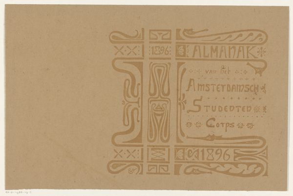
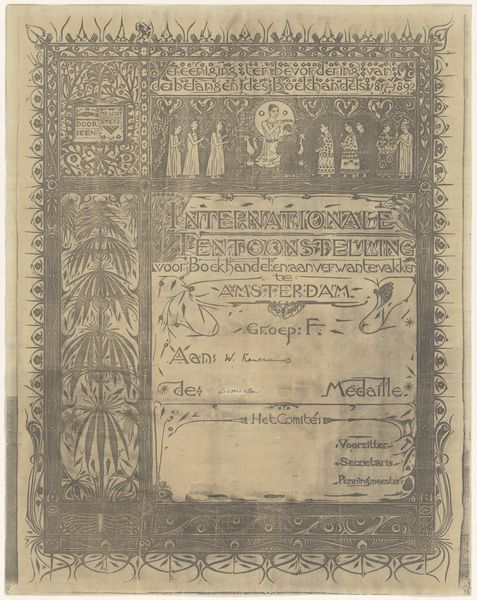
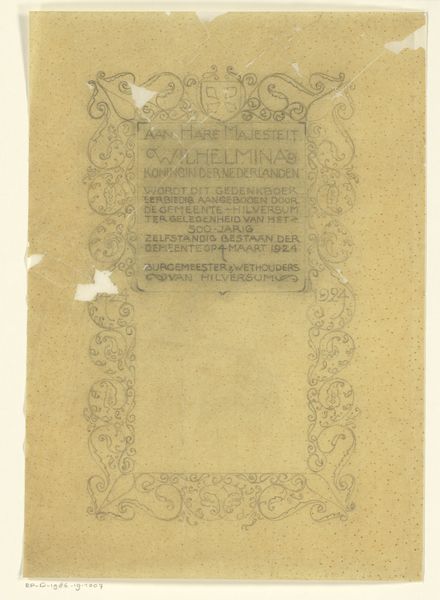
Bandontwerp voor: Almanak van het Amsterdamsch Studenten Corps, 1896 1896
0:00
0:00
graphic-art, typography, poster
#
graphic-art
#
aged paper
#
toned paper
#
art-nouveau
#
old engraving style
#
hand drawn type
#
tea stained
#
personal sketchbook
#
typography
#
hand-drawn typeface
#
fading type
#
sketchbook drawing
#
poster
#
sketchbook art
Dimensions: height 324 mm, width 463 mm
Copyright: Rijks Museum: Open Domain
Reinier Willem Petrus de Vries created this cover design for the Amsterdam Student Corps Almanac in 1896, likely using ink on paper. This wasn’t just any paper, but a support carefully chosen for its texture and ability to receive the ink. The design blends typography with geometric and organic motifs, a hallmark of the Art Nouveau style then in vogue. Look closely, and you'll notice the precision required to render these intricate details, demanding a skilled hand and meticulous process. The image has an etched or printed quality, which implies a mechanized process. This would allow for the mass production of the cover, aligning the design with the commercial demands of the time. The cover embodies the aspirations and aesthetics of a specific social group: affluent students. It suggests that even an everyday object like a student handbook could become a canvas for artistic expression, blurring the boundaries between commercial design, craft, and fine art.
Comments
No comments
Be the first to comment and join the conversation on the ultimate creative platform.
More like this