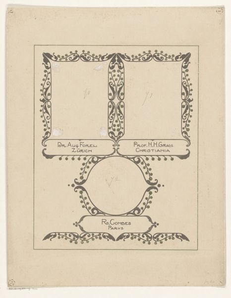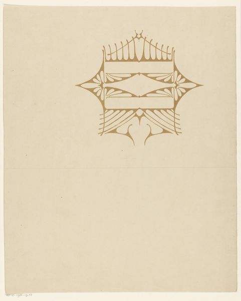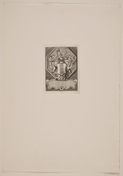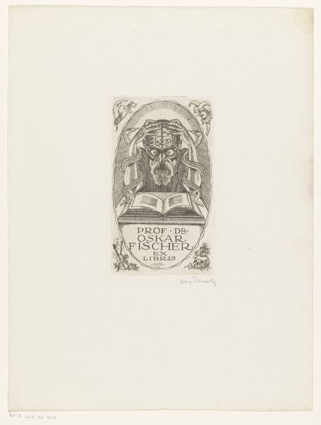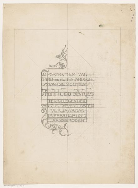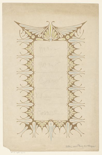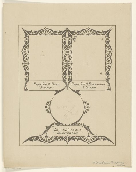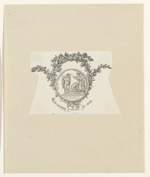
Ontwerp voor een briefhoofd en sluitvignet van Atelier voor Sierkunsten Mimosa te Hilversum 1884 - 1952
0:00
0:00
drawing, graphic-art, typography, ink
#
drawing
#
graphic-art
#
art-nouveau
#
form
#
typography
#
ink
#
line
#
decorative-art
Dimensions: height 270 mm, width 201 mm
Copyright: Rijks Museum: Open Domain
Editor: So this is "Ontwerp voor een briefhoofd en sluitvignet van Atelier voor Sierkunsten Mimosa te Hilversum," made sometime between 1884 and 1952, a design by Reinier Willem Petrus de Vries. It looks like it's ink on paper, a study for stationary perhaps? It's delicate and clearly Art Nouveau. What leaps out at you when you look at it? Curator: Oh, it whispers to me of possibilities. I imagine the scent of ink, the scratch of the nib… Do you see how the lettering itself becomes a dance? The title is really an orchestra, isn’t it? All of those flourishes - little organic tendrils. And "Mimosa” itself—conjuring images of that vibrant, almost sun-like flower…I wonder about the artist and their vision for Atelier Mimosa. What kind of image were they trying to convey? Editor: Definitely a high-end image, right? It seems a little bit precious perhaps? Curator: Perhaps, but isn't all beauty a bit precious? Look at how those repeating dots above and below almost create a secret language. There's something both comforting and slightly…formal about it. Almost secretive too. You almost want to fold the letter and keep its secrets close. And Hilversum, a place so rooted in landscape… Imagine receiving a letter with this crest - that blend of natural and crafted, of word and image… Editor: I get that. I hadn’t really considered the secrets the design held or even that it felt secretive! So much to think about, beyond just 'pretty letters'. Thanks for your insights. Curator: And thank you! Looking closer helps me appreciate the silent conversations happening on the page, the story held in simple curves and carefully placed dots.
Comments
No comments
Be the first to comment and join the conversation on the ultimate creative platform.
