drawing, print, pen, engraving
#
drawing
#
pen drawing
#
dutch-golden-age
# print
#
geometric
#
pen
#
cityscape
#
engraving
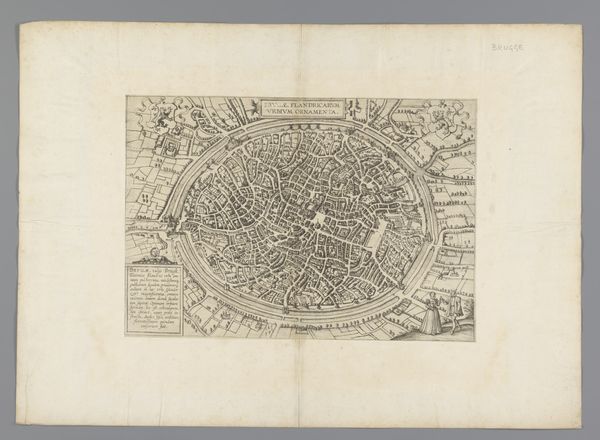
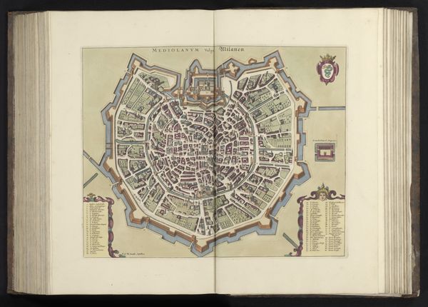
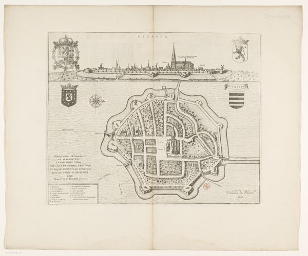
Dimensions: height 403 mm, width 495 mm
Copyright: Rijks Museum: Open Domain
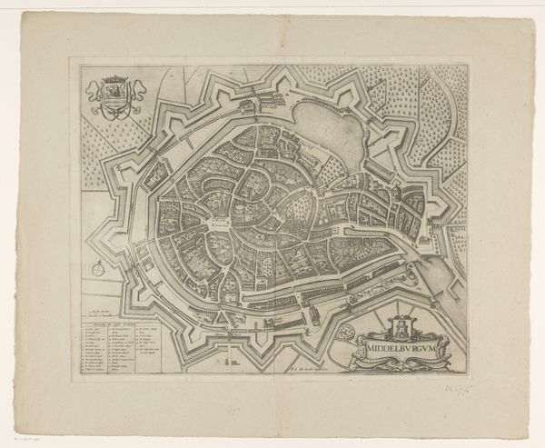
Curator: So, here we have an early 18th-century map, "Plattegrond van Brugge," of Bruges, made with pen and engraving. It's so precise; what catches your eye? Editor: It's the rigid, almost oppressive, geometry! Seeing the entire city compressed within these walls, I wonder, what did it *feel* like to live there? Curator: Exactly! Maps aren't neutral; they reflect power structures. Consider who commissioned this: Likely the city's governing body, wanting to project an image of control and order. This isn't just about geography, it's about asserting dominance over space and, by extension, its inhabitants. What’s visually prioritized? Editor: Definitely the fortifications! The walls, the moats… they emphasize the city's defensibility. Almost as if the map's primary function was military intelligence. Curator: Precisely. But beyond military concerns, think about who *benefits* from such control. Were those fortifications as much about keeping people *in* as keeping invaders out? How might marginalized communities have experienced this "order?" Editor: I never thought about it that way. Now, that level of planning also seems a bit unsettling! Like the panopticon? Curator: A very astute comparison! This visual representation could foster discipline, or be propaganda, demonstrating authority. Editor: It's incredible how a simple city map opens up so many questions about power, control, and lived experience. It is unsettling. Curator: Indeed! That’s what makes even seemingly mundane historical artifacts so vital. They can reflect the lives of those whose stories might otherwise go unacknowledged. There's so much history embedded in it.
Comments
No comments
Be the first to comment and join the conversation on the ultimate creative platform.
More like this