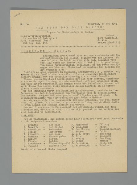
print, typography, poster
#
art-nouveau
# print
#
typography
#
decorative-art
#
poster
Dimensions: height 330 mm, width 230 mm
Copyright: Rijks Museum: Open Domain
This subscription form was printed by H. Kleinmann & Co. of Haarlem in 1896 for their journal on decorative arts. It speaks to the growing institutionalisation of art and design in the late 19th century. Printed in five languages – Dutch, French, German, English and Italian – the form suggests an international market for design ideas. Industrialisation and mass production created a demand for designers, and publications like this one helped to circulate new styles and techniques. The form is an interesting survival because it embodies a particular moment in the history of art education. It suggests a desire to codify and disseminate what was considered good taste. Historians of art and design use subscription lists, publishers' records, and other archival sources to understand the economic and social context in which art is made and consumed. These help us to interpret the public role of art and its relationship to broader social and economic trends.
Comments
No comments
Be the first to comment and join the conversation on the ultimate creative platform.
More like this