drawing, lithograph, print, typography, poster
#
drawing
#
lithograph
# print
#
typography
#
poster
Dimensions: Sheet: 8 3/8 × 5 1/4 in. (21.2 × 13.3 cm)
Copyright: Public Domain
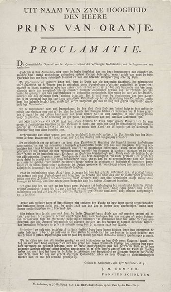
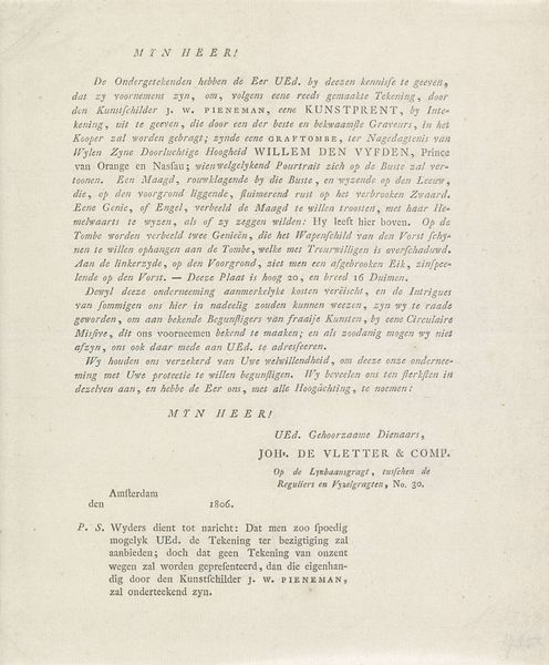
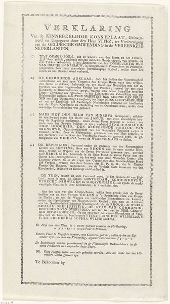
Curator: This lithograph, a trade card from 1820, strikes me first with its stark contrasts. The black typography against the off-white paper creates a strong visual hierarchy, wouldn’t you agree? Editor: Yes, definitely. This "Trade Card for Burgis's Lithographic Drawing Books", from 1820, seems almost like a modern poster, doesn’t it? The typography is so direct. I initially feel the artist created an easy and direct advert. How do you interpret it? Curator: Its appeal lies precisely in that functionality. Observe how the composition directs our gaze. "BURGIS'S Lithographic Drawing Books" boldly announces the product, while the subsequent text elaborates on its virtues. Do you see the visual strategy employed? Editor: I see that. The font sizes and placement emphasize key selling points. What's most fascinating to me is the long block of text selling all of Burgis's features and services. How is that part of the artwork instead of simply marketing? Curator: Good question. Consider the rhythm and structure of that text block. The carefully crafted sentences, with their internal clauses and parallel constructions, create a textual tapestry. Its complexity enhances the visual richness of the entire card, contributing to its impact as a work of design. We must note also the deliberate emphasis on 'accurate' representation that, beyond advertisement, speaks to broader aesthetic considerations and a philosophical ideal of representation at this time. Editor: So, the structure and the wording create an argument beyond a simple sale? Curator: Precisely. The form and content are inseparable, elevating it beyond mere advertisement to a compelling artifact of visual culture. Editor: It’s fascinating to think about advertising as more than just a sell. It feels almost like the design and font are doing some selling here. Curator: Yes, an unexpected way of considering typography.
Comments
No comments
Be the first to comment and join the conversation on the ultimate creative platform.
