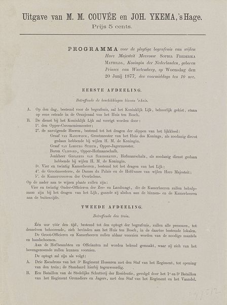
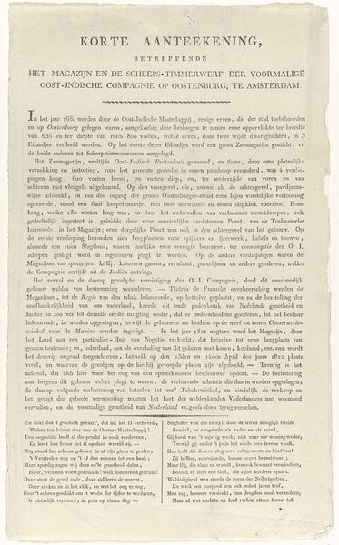
graphic-art, print, typography
#
graphic-art
#
neoclacissism
# print
#
typography
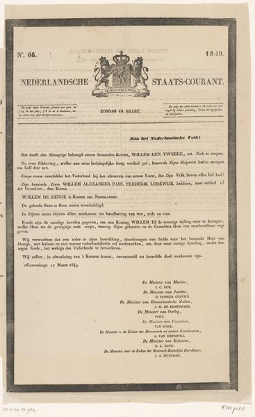
Dimensions: height 380 mm, width 265 mm
Copyright: Rijks Museum: Open Domain
Editor: Here we have "Eerste proclamatie uitgevaardigd door koning Willem III, 1849," potentially from 1849, a print by Kemink & Zoon. It strikes me as a very official document, severe in its presentation with that formal typeface. What can you tell me about this proclamation in the broader scope of art and history? Curator: This piece gives us a direct entry point into the political landscape of the Netherlands in 1849. Think of it not just as a document, but as a carefully constructed piece of state propaganda. The use of neoclassical typography reinforces ideas of order and authority, harking back to Roman ideals of governance. Editor: Propaganda, really? It just looks like text to me. Curator: Exactly, and that's where its power lies. The proliferation of printed material like this in the 19th century was key in shaping public opinion. Willem III is attempting to project an image of stability and continuity amidst the revolutionary fervor sweeping across Europe at the time. How does this piece perform a public role? Editor: So, it's less about the artistic skill and more about its function? The act of printing and displaying this makes a statement about power. I suppose even typography has its own politics, conveying messages subtly. Curator: Precisely. And considering who had access to and control of printing presses back then is key. Studying these visual artifacts can reveal the often-uneven playing field on which public discourse happened, or was structured. It's amazing how this piece reflects power through its use. Editor: It does give me a whole new appreciation for the politics embedded within the imagery and presentation, and how we analyze power through text. Thanks!
Comments
No comments
Be the first to comment and join the conversation on the ultimate creative platform.
More like this