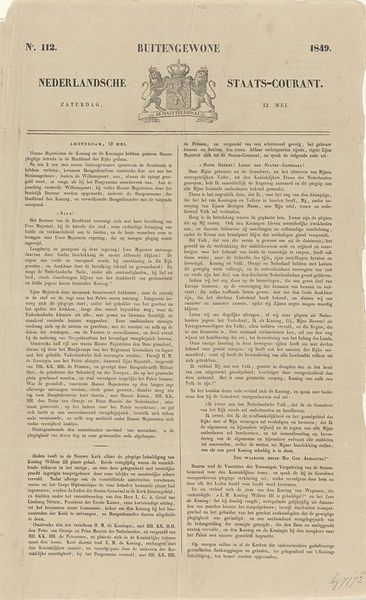
Nederlandsche Staats-Courant. Zondag 18 Maart. N. 66. 1849 Possibly 1849
0:00
0:00
algemeenelandsdrukkerij
Rijksmuseum
print, typography, poster
#
dutch-golden-age
# print
#
typography
#
poster
Dimensions: height 410 mm, width 255 mm
Copyright: Rijks Museum: Open Domain
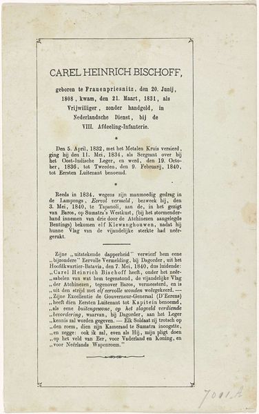
Curator: I find myself drawn to this newsprint poster, “Nederlandsche Staats-Courant. Zondag 18 Maart. N. 66. 1849,” which can be loosely dated to around 1849. Editor: It looks like a death announcement—stark and somber, the rigid typography and the national crest conveying an almost cold formality. Curator: Indeed. The Algemeene Landsdrukkerij printed it upon the death of King Willem II. The typography itself holds tremendous significance, the weight and choice of font evoking an aura of officialdom and historical importance. Notice how the page layout emphasizes a clear hierarchy. Editor: And reading it, we learn this “official” declaration is less about the individual king and more about solidifying state power after a death, ensuring a smooth transition. I see an appeal to Dutch patriotism, invoking God to oversee a sense of national unity and duty. "Wij verwachten dat een ieder..." – "We expect that everyone in their own assignment..." Curator: Precisely, and consider how the Staats-Courant itself acts as a visual embodiment of that state power. Its legibility, the distribution, even the aesthetic choices, communicate order, authority, and permanence—ideals the monarchy needed to project during a moment of crisis. Editor: That emblem reinforces this, lions rampant flanking a crowned shield emblazoned with "Je Maintiendrai"— "I shall maintain." This phrase is almost aggressive, not to the Dutch, but to a people the empire might claim as their own in other colonial sites. In this light, this image seems less about unity and more about power over others. Curator: That interpretation definitely provides some very rich layers of complexity that must not be ignored when one seeks to decode a piece of history. However, the poster does act as a record. Its function was likely one of public record and the dissemination of information. One finds the use of black ink to contrast the cream colour. The use of negative space and the balanced layout all suggest the Algemeene Landsdrukkerij tried to find some equilibrium on the page and on the emotional hearts of their Dutch public. Editor: Whether seeking solace or maintaining colonial power, this print reveals much about how state ideology functions. Thanks for elucidating this visual text. Curator: My pleasure, your focus brought so much rich subtext to light!
Comments
No comments
Be the first to comment and join the conversation on the ultimate creative platform.
More like this