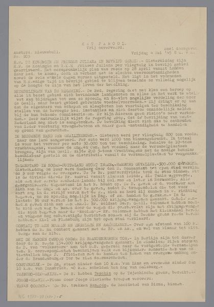
print, paper, photography
# print
#
paper
#
photography
Dimensions: height 297 mm, width 210 mm
Copyright: Rijks Museum: Open Domain
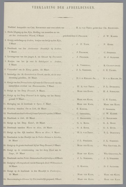
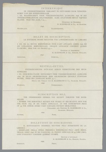
This is a newspaper clipping from 1945 made by Jo Vis with ink on paper. It’s all about the way that simple marks, repeated, can carry the weight of information. Look closely at the way the text is aligned, justified, and spaced on the page. Each letter, each word, each line is evenly distributed, creating a rhythmic effect which is both functional and visually satisfying. See how the straight lines of the text blocks are offset by the handwritten notes at the top right and bottom left, giving the layout a pleasing asymmetrical quality. This simple document is made with the intention of conveying information, but in its own way, Vis’ organisation of the page also shows how the bare bones of typographic design can become something poetic, and that it is possible to create something expressive with simple tools. The spirit of this work reminds me a little of the work of Corita Kent, who, though working in a very different medium, similarly found beauty in the everyday, and in the arrangement of words on a page.
Comments
No comments
Be the first to comment and join the conversation on the ultimate creative platform.
More like this