#
word art style
#
pattern out of typography
#
hand-lettering
#
lettering
#
playful lettering
#
hand drawn type
#
hand lettering
#
word art
#
eye-catchy type
#
small lettering
Copyright: Public domain US
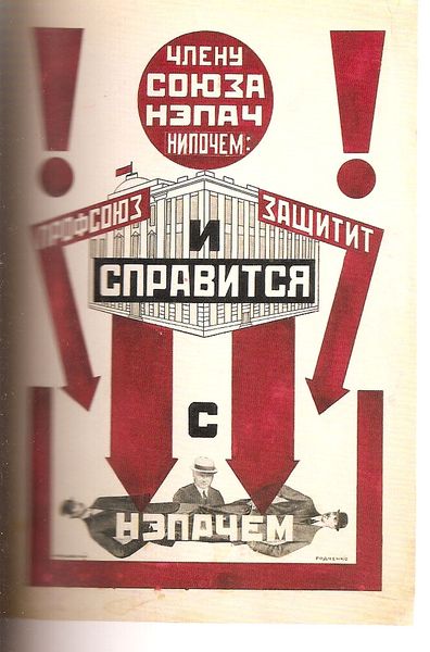
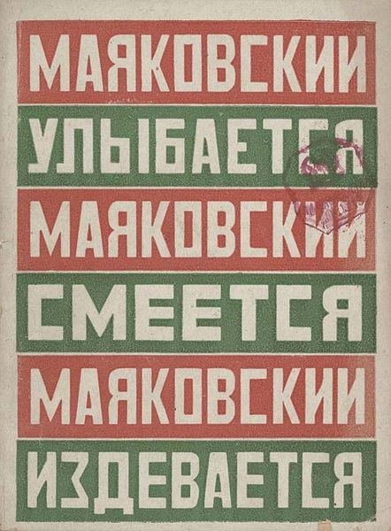
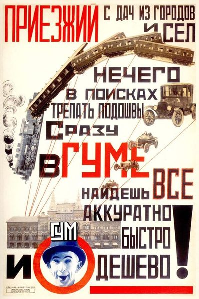
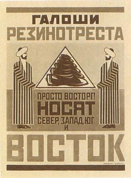
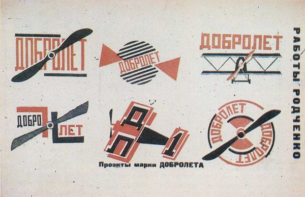
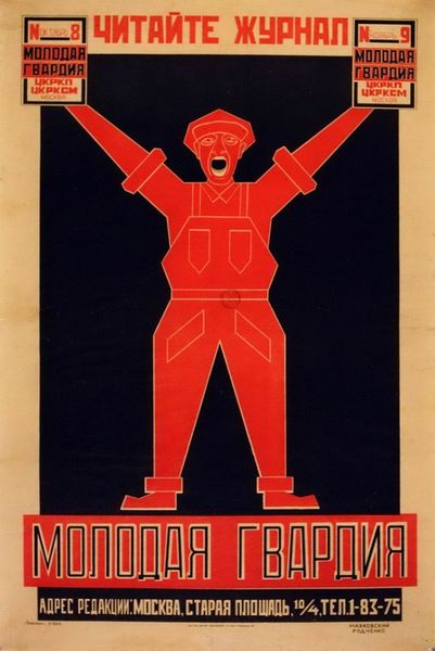
This advertising poster for Moser watches was made by Alexander Rodchenko, and right away, you can tell that this is a piece that’s all about function, right? Rodchenko isn't messing around with superfluous details; he's laser-focused on getting the message across with simple shapes. I love the limited palette of red and white. There is something so direct about that choice. Look at the way he repeats the images of the watches, it is almost like an assembly line; he is cranking out graphic images for a new kind of world! The shapes lock together, almost like a puzzle, and the text is bold and declarative. I’m reminded of El Lissitzky, another Russian artist who was doing equally wild and ambitious work at the time. There’s such energy in these works – a sense of possibility, of breaking away from the past and forging a new future. Art is always a conversation, and Rodchenko was definitely listening and responding to the world around him. And just like any good conversation, it leaves you thinking, questioning, and maybe even wanting to start something new yourself.
Comments
No comments
Be the first to comment and join the conversation on the ultimate creative platform.
More like this