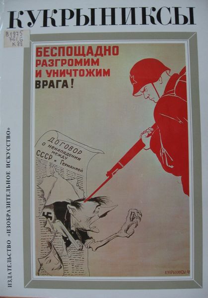
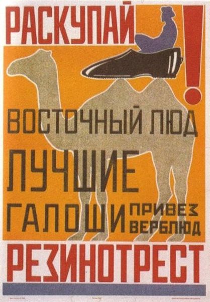
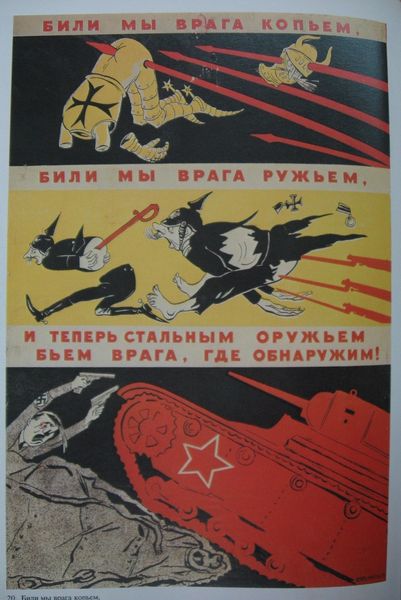
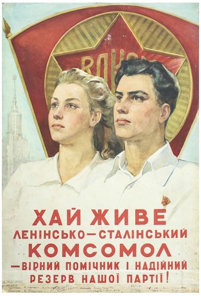
graphic-art, collage, print, typography, poster
#
graphic-art
#
collage
# print
#
typography
#
constructivism
#
soviet-nonconformist-art
#
typography
#
geometric
#
cityscape
#
poster
Copyright: Public domain US
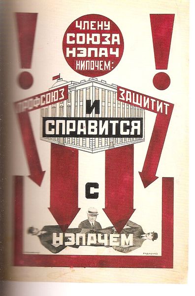
Editor: Right now, we're looking at Alexander Rodchenko's 1923 advertisement for GUM, the department store. It’s a collage and print – so striking with its clashing angles and bold typography! It feels very…dynamic, almost chaotic. What jumps out at you when you look at this? Curator: Chaotic is definitely one word for it! For me, it feels like a visual shout, a raw, enthusiastic burst of energy. Remember, this is post-Revolution Russia, a society being rebuilt from the ground up. Look at how Rodchenko uses those trains and cars. What do you see in their upward trajectory? Editor: Movement, maybe progress? The trains seem almost… precariously balanced, though. Curator: Exactly! There’s this incredible tension between optimism and instability. The promise of a brighter future, but also the anxiety of rapid change. Then you have that fellow in the hat. Almost a clownish figure…do you think he's selling you a dream? And how do the colours impact your reading of the piece? Editor: He does look a bit like he’s trying a bit too hard to look trustworthy, and red is for revolution and change. Overall the limited palette makes this easier to digest Curator: It's fascinating how Rodchenko takes something as simple as an advertisement and turns it into a potent visual statement about a society in flux, wouldn't you say? Editor: Definitely! I had just thought about it as being a bit overwhelming but learning all this new context, I find it an extremely deep dive into a historic moment. Curator: And I was pleasantly reminded how accessible Rodchenko makes it, all through those sharp angles and familiar colours.
Comments
No comments
Be the first to comment and join the conversation on the ultimate creative platform.
More like this