drawing, print, paper, ink
#
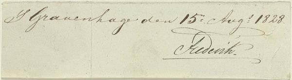
portrait
#
drawing
#
aged paper
#
toned paper
#
ink paper printed
# print
#
sketch book
#
hand drawn type
#
paper
#
personal sketchbook
#
ink
#
hand-drawn typeface
#
sketchbook drawing
#
genre-painting
#
sketchbook art
#
watercolor
#
calligraphy
Copyright: Rijks Museum: Open Domain
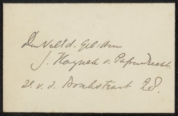
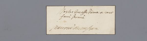
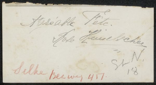
Curator: This unassuming little card, "Visitekaartje aan Philip Zilcken," exists somewhere in the period between 1867 and 1930, attributed to Clasina Koppenol-Vogels. It’s a combination of drawing and print, ink on paper. What leaps out at you? Editor: Anachronism, I suppose. The cardstock looks antiquated. It also feels like a tiny act of quiet resistance, perhaps—an antiquated medium holding ground against…well, what exactly was it resisting? The march of modernity, maybe? The standardization of social rituals? Curator: Oh, that’s delicious. It’s funny; the aged paper, for me, suggests not resistance but an intimate message delivered across time. Think of it: someone deliberately choosing a handmade approach over the speed and anonymity of mass-produced cards. It's about touch, connection...maybe even fragility? Editor: True. And the handwritten address reinforces that personalized element. “2de Waterleiding weg,” so simple, so specific. However, if you want to frame it with more scrutiny, the use of that Gothic-style font evokes a specific historical moment, too, when nationalist sentiments and romanticized views of the past were gaining momentum in Europe. The card aesthetic can be seen as both personal and ideologically positioned, reflecting traditional values and identity. Curator: Ooh, yes! I like that reading so much better than my initial cozy assumptions! It throws everything into a new, exciting light. It makes me want to understand the relationship between Clasina Koppenol-Vogels and Philip Zilcken! Editor: Indeed. What did they talk about? Who did they see? It all swirls into questions about societal values, class, and, frankly, aesthetic belonging. That interplay between a private note and an unspoken stance. Curator: Right? That contrast feels powerful. Here's this seemingly straightforward, unassuming note that opens this unexpected doorway into wider social observations. Editor: Precisely! It reminds us that these tiny artifacts are mirrors—refracting both personal connections and the complex narratives that shaped the very circumstances of that meeting. Thank you, Clasina, for making your intentions complicated. Curator: Yes, a perfect example of an unassuming invitation to reflect more critically on culture itself! Thanks Clasina, indeed!
Comments
No comments
Be the first to comment and join the conversation on the ultimate creative platform.
More like this