graphic-art, paper, typography, poster
#
graphic-art
#
art-nouveau
#
paper
#
typography
#
poster
Dimensions: height 152 mm, width 226 mm
Copyright: Rijks Museum: Open Domain
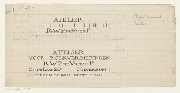
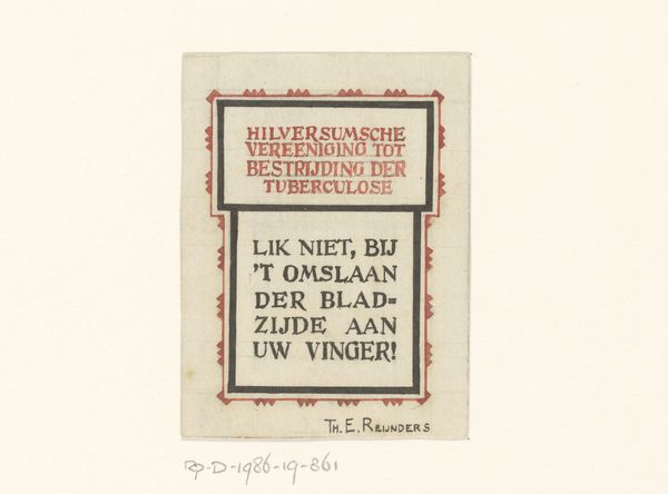
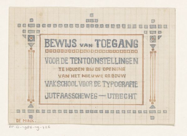
Reinier Willem Petrus de Vries made this drawing, titled 'Kader met de tekst 'Nederlandsche boekversieringen,' sometime around 1910, probably with ink and pencil on paper. It’s like a plan, carefully mapped out on a grid, showing the architecture of graphic design. What strikes me is the handmade nature of it all. The grid gives it structure, but the tiny marks around the edges feel so deliberate and crafted. Look at how each little flag has slight variations, an insistence on the mark, rather than a perfect duplication. The colours, muted reds and blacks, create a gentle rhythm, almost like musical notation. It reminds me of the work of Paul Klee, who also used grids and simple forms to explore complex ideas. Both artists seem to be interested in the intersection of order and chaos, control and spontaneity. In the end, it's all about possibilities.
Comments
No comments
Be the first to comment and join the conversation on the ultimate creative platform.
More like this