drawing, paper, pen
#
portrait
#
drawing
#
aged paper
#
script typography
#
hand-lettering
#
hand drawn type
#
hand lettering
#
paper
#
personal sketchbook
#
hand-drawn typeface
#
fading type
#
sketchbook drawing
#
pen
#
sketchbook art
#
modernism
Copyright: Rijks Museum: Open Domain
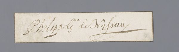
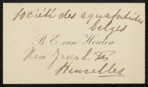
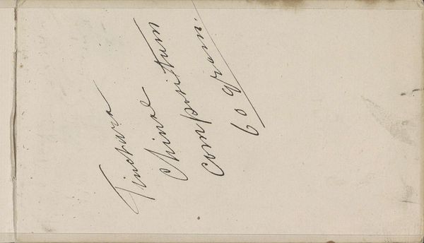
Curator: Let’s take a look at this intriguing drawing, "Visitekaartje aan Philip Zilcken," likely created sometime between 1867 and 1930. It seems to be a calling card done with pen on paper, offering a glimpse into a specific social interaction. Editor: My initial impression is one of delicate ephemerality. The aged paper has a muted tone, the text appears subtle, faded almost. Curator: Absolutely, it’s a faint echo of a past encounter. “Mademoiselles Danish D’Alezzio” is the name elegantly lettered on the card, along with a handwritten initial. In the late 19th and early 20th centuries, these cards were powerful social currency, laden with meanings about class, gender, and who was deemed worthy of connection. Editor: Focusing on the typographic elements, there's a distinct contrast between the more formal, typeset name and the handwritten flourish below. Note how the artist seems to deliberately "strike through" the “Me” of Mademoiselles and a letter "a." –an intriguing act of almost... erasure? What are we to make of this conscious obfuscation? Curator: That's a potent observation. The act of striking through can symbolize a refusal of certain social expectations or perhaps the conscious dismantling of rigid identity categories. The erasure performs its own act of subversion, perhaps even pointing to the precarious position of women, or nonbinary individuals, negotiating social spaces at the time. Was there a tension, perhaps, between publicly presented identity and private persona? Editor: It prompts a reading of liminality, doesn’t it? Also, the delicate, almost tentative lines of the script suggest a fleeting moment captured – a glimpse, rather than a definitive statement. Curator: Yes, a negotiation of visibility. Perhaps, the hand-lettering whispers of the personal touch amidst a culture governed by convention. What do we see here in terms of coded meaning? Who has the privilege to introduce themselves this way and what does it say about who receives such an introduction? Editor: From a formal perspective, it serves as a beautiful study in contrasts: formal versus informal, light versus shadow – though subtle, these tensions elevate a simple calling card into something far more nuanced and visually compelling. The restraint itself speaks volumes. Curator: Exactly! Through what might appear to be a simple card, the drawing prompts deeper engagement with ideas about social structure, identity formation, and gendered expression in this period. It makes you consider the many invisible social protocols that we now recognize, consciously or not. Editor: It truly makes you rethink the significance of the minimal, demonstrating the aesthetic weight and emotional depth within simple structures.
Comments
No comments
Be the first to comment and join the conversation on the ultimate creative platform.
More like this