graphic-art, paper, typography
#
portrait
#
graphic-art
#
type repetition
#
sand serif
#
aged paper
#
homemade paper
#
16_19th-century
#
pale palette
#
desaturated colours
#
light coloured
#
paper
#
typography
#
folded paper
#
thick font
#
thick lined
#
realism
Copyright: Rijks Museum: Open Domain
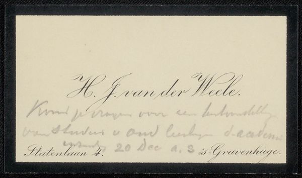
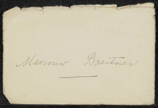
This is Alexander Ver Huell's 'Visitekaartje', a calling card, made some time in the 19th century. The immediate impression is one of stark simplicity. A muted, off-white rectangle serves as the ground for a centered, single line of text. The text itself – ‘Mr. A. W. M. C. Ver Huell’ – is rendered in a small, unadorned serif typeface. Here, the arrangement of elements creates meaning through strategic deployment of space and typography. The card presents a very constrained visual vocabulary: the restraint is a kind of signifier in itself. The typeface lacks any decorative flourish, indicative of a kind of unadorned and direct communication. It doesn't just convey the identity of its owner but also speaks to societal structures and codes of conduct of its time. The emphasis isn't just on what is presented, but also on what has been deliberately omitted. In its visual form, this calling card is more than just identification, it invites us to consider the semiotics of social exchange.
Comments
No comments
Be the first to comment and join the conversation on the ultimate creative platform.
More like this