graphic-art, print, paper, engraving
#
script typeface
#
graphic-art
#
hand-lettering
#
baroque
# print
#
hand drawn type
#
hand lettering
#
paper
#
text
#
hand-written
#
fading type
#
stylized text
#
thick font
#
history-painting
#
handwritten font
#
engraving
#
small lettering
Dimensions: height 139 mm, width 115 mm
Copyright: Rijks Museum: Open Domain
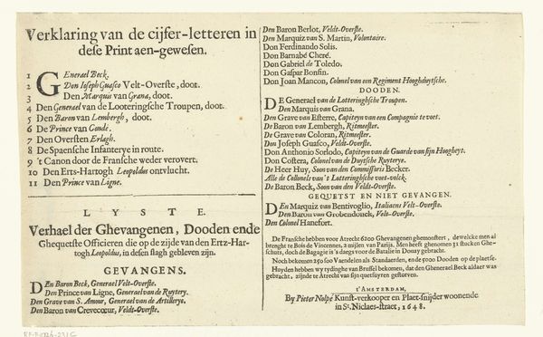
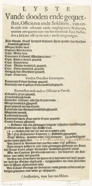
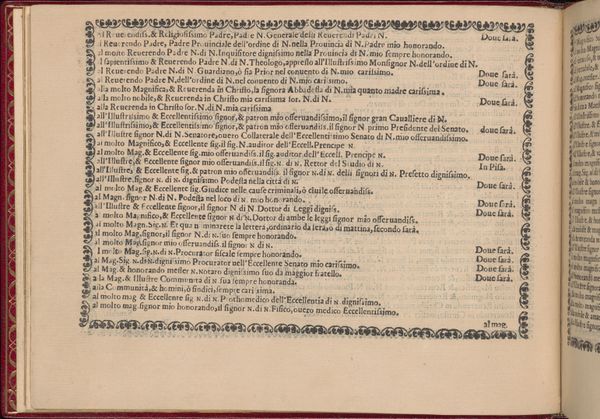
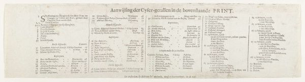
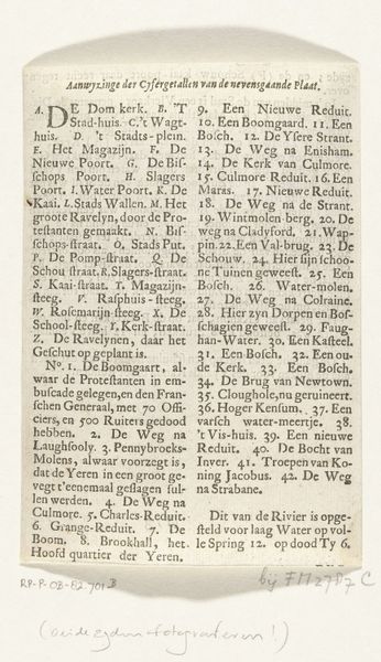
Editor: So, here we have a print titled "Verklaring bij de prent van de slag bij Lobositz, 1756," created in 1756 by Bernardus Mourik. It's essentially a list, or legend, and honestly, it's kind of a downer. It seems to detail casualties and strategic positions in a battle. What can you tell me about its historical context and what this piece is really trying to convey? Curator: It’s certainly a sobering artifact. Looking at it through a historical lens, consider the print’s role as public information. It's not just a list; it’s a carefully curated narrative following the Battle of Lobositz. Mourik isn’t simply presenting facts; he’s framing a specific interpretation of the conflict, particularly regarding the Austrian losses. How might the display and dissemination of this print have influenced public perception of the war? Editor: That’s interesting. So, it’s less about pure information and more about shaping public opinion? Was this a common practice at the time? Curator: Absolutely. The Baroque period, while known for its grandeur, also saw a rise in the use of prints for political purposes. Think about the printing press’s capacity to reproduce and distribute images and text quickly. This engraving could have served to rally support or justify certain actions, perhaps to deflect criticism of military strategy. Is there anything in the text itself that stands out to you in that light? Editor: Now that you mention it, the phrases "gefallen" (fallen) and "verwundet" (wounded) next to many high-ranking names – Prussians before Austrians, no less - suggest a heavy toll, though possibly an unbiased one. Curator: Precisely. The choice of language, the order in which the information is presented, and even the aesthetic style of the lettering contribute to its overall message. It's a potent example of how art intersects with power and propaganda. What have you noticed about institutions which preserve this kind of artifacts? Editor: I didn't even consider it being propaganda initially, I was looking at the artistry! Thinking about where this piece resides now – the Rijksmuseum – how does its contemporary presentation impact how we understand the historical implications? Curator: It’s fascinating to consider. The museum's display transforms what was once a piece of public discourse into an object of historical study and artistic merit. It allows us to analyze the politics of imagery and the role of art in shaping collective memory. Editor: Wow, I'll never look at a simple list the same way again. It's amazing how much a seemingly straightforward piece can reveal about the social and political forces at play during its time.
Comments
No comments
Be the first to comment and join the conversation on the ultimate creative platform.
More like this