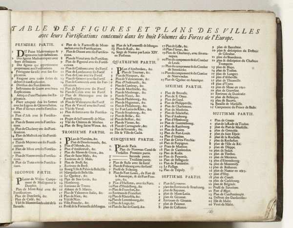
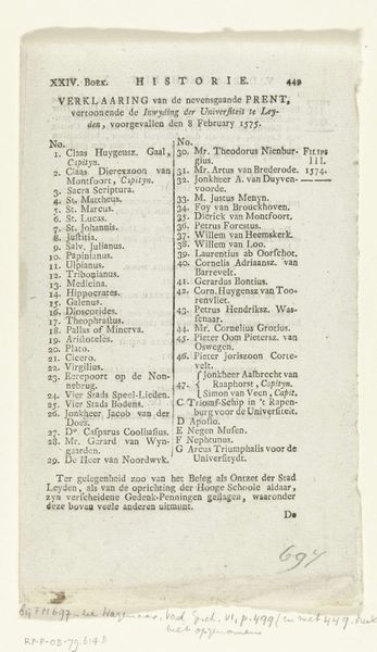
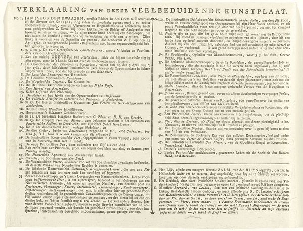
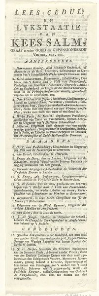
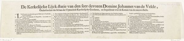
Grote kaart van het beleg van Namen (eerste tekstblad), 1695 1695
0:00
0:00
nicolaesiivisscher
Rijksmuseum
print, engraving
#
hand written
#
hand-lettering
#
baroque
# print
#
lettering
#
hand drawn type
#
hand lettering
#
hand-written
#
fading type
#
stylized text
#
islamic-art
#
handwritten font
#
engraving
#
small lettering
Dimensions: height 138 mm, width 635 mm
Copyright: Rijks Museum: Open Domain
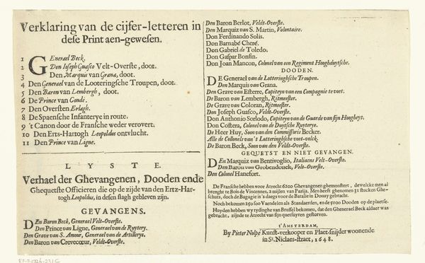
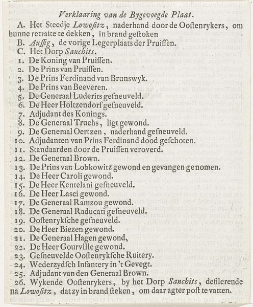
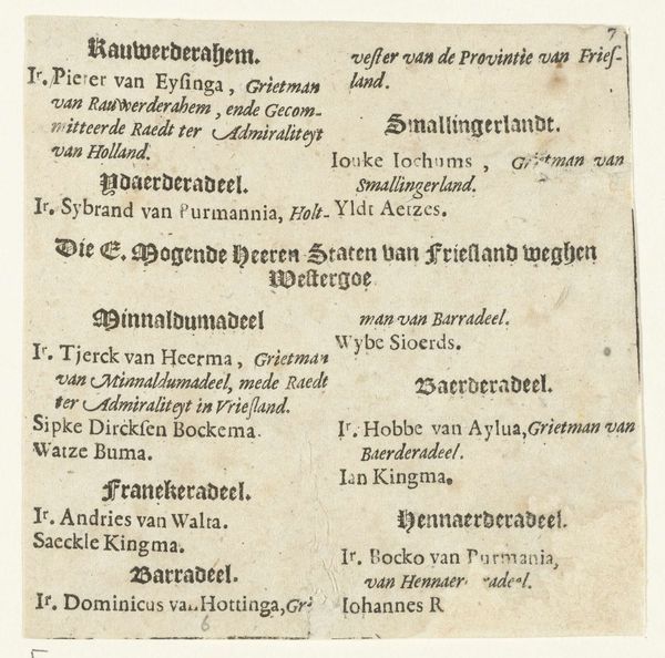
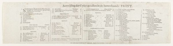
Curator: Let's take a look at this print, titled "Grote kaart van het beleg van Namen (eerste tekstblad)," which translates to "Large map of the siege of Namur (first text sheet)." It was created by Nicolaes Visscher II in 1695, now residing in the Rijksmuseum collection. My first reaction is to appreciate the precision of the handwritten lettering! Editor: Indeed, the density and stylistic variation within the lettering immediately catch the eye. The piece seems wholly dedicated to type, an unusual subject matter, I think, giving a rather somber impression given it's almost monochrome palette. Curator: What strikes me is its function. It's not merely decorative; this is essentially a key to understanding a map. Each entry explains what a certain symbol or letter represents on the corresponding map of the siege, providing context about fortifications, buildings, and military positions around the city. This blend of cartography and political history, I find truly fascinating. Editor: That's valid. Yet, focusing solely on the representational value may lead us away from appreciating the aesthetic arrangement and interplay between forms and voids on the page. Observe how the lines of text, divided into rectangular blocks, form a clear and balanced composition. Note also the intentional placement of the bolder headers amidst these dense areas. The calligraphic style, while conveying factual information, also contributes to the engraving's artistic character. Curator: I concede that the aesthetic is undeniably of its period, baroque. However, the "beauty" here really exists in the way information is categorized and structured to make sense of a very specific moment in the siege of Namur. Editor: And in this moment, the layout, letter forms and engraving style reflect a historical shift where formalized typography gained artistic and informative currency. The attention to detail serves less as direct propaganda or blatant historical representation, and more so towards organizing information which gives us access into military strategies of this historical moment. Curator: True, it’s this synthesis that gives this single text sheet such resonance. It’s a portal to a past conflict viewed through the lens of information and control. Editor: Exactly. It serves as both an emblem of clarity and order as well as an intricate demonstration of typographic form and execution.
Comments
No comments
Be the first to comment and join the conversation on the ultimate creative platform.
More like this