Ghirlanda: Di sei vaghi fiori scielti da piu famosi Giardini d'Italia, page 4 (verso) 1604
0:00
0:00
drawing, print, paper, typography, ink
#
drawing
# print
#
paper
#
typography
#
ink
#
italian-renaissance
Dimensions: Overall: 5 7/8 x 7 7/8 in. (15 x 20 cm)
Copyright: Public Domain
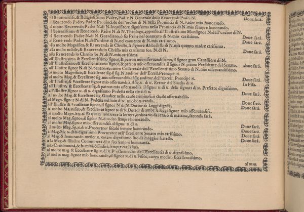
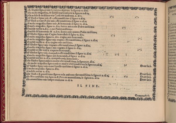
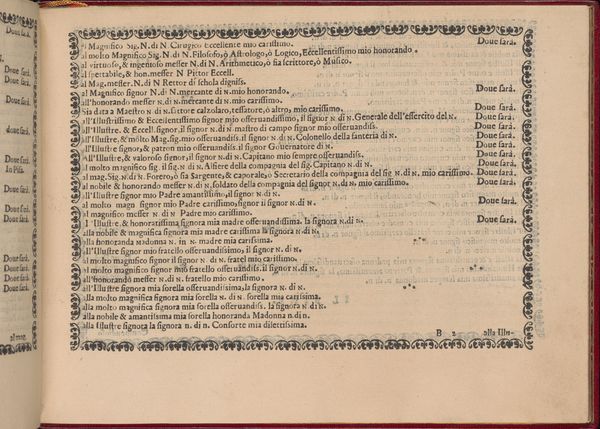
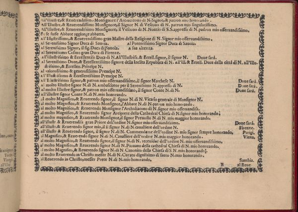
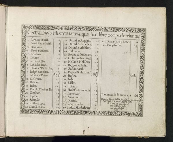
Curator: This intriguing page comes from Pietro Paulo Tozzi's *Ghirlanda: Di sei vaghi fiori scielti da piu famosi Giardini d'Italia*, a print and drawing on paper from 1604. Editor: It reads to me almost as a visual poem, or maybe even a code. The dense text surrounded by that decorative border—there’s a clear sense of considered arrangement at play, yet something feels almost oppressive about the uniformity of the forms. Curator: From a material perspective, the choice of typography is critical. We're dealing with the incunabula of early printing. Tozzi used ink to produce a series of dedicatory inscriptions, templates for formal letters suitable to varying ranks in society, mirroring the rigidly structured hierarchy of the time. Editor: So the seemingly repetitive text is not just filling space. Look closely, and the typography itself varies, the flourishes, the weights—each variation must signify something deliberate within the context of those social rankings. It's a hierarchy visualized. Curator: Precisely. This piece wasn’t created in a vacuum. To fully understand this work, you need to consider its economic and social context: The hierarchies within printmaking workshops, the commerce of disseminating courtly culture, the rising rates of literacy… These letters acted as both template and symbol of social performance. Editor: Yet the effect is almost dizzying. The meticulous rendering almost undermines the possibility of reading any real, embodied intention within these textual structures, or within this object. Is this how Tozzi critiques the emptiness of courtly gestures, or an elaborate reproduction? The frame, filled with stylized flowers, creates a sharp contrast to the regimented text; however, it can also become a binding visual mechanism. Curator: The presence of a decorative, botanical "frame" reminds us of the social context, highlighting consumption practices and artisanal knowledge associated with garden design. But there's always that dialogue between art and its practical function in these situations. Editor: Looking at it again, I notice an intense relationship with language and symbolism that, in this context, I now understand with far more clarity than when I initially approached it. Curator: Absolutely, the more we break down those structures of meaning, the more meaningful these visual texts appear to become!
Comments
No comments
Be the first to comment and join the conversation on the ultimate creative platform.
More like this