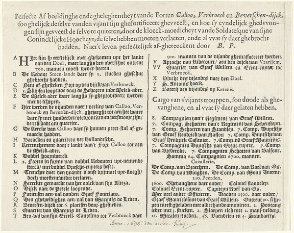
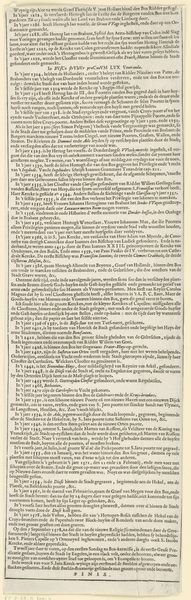
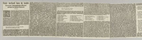
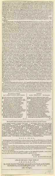
Tekstblad bij de prent van het beleg van Bergen op Zoom door Spinola, 1622 1622
0:00
0:00
hendrikjanszverstraelen
Rijksmuseum
graphic-art, print, typography, engraving
#
graphic-art
#
dutch-golden-age
# print
#
typography
#
engraving
Dimensions: height 179 mm, width 242 mm
Copyright: Rijks Museum: Open Domain
Curator: Here we have a page of text accompanying an engraving, “Tekstblad bij de prent van het beleg van Bergen op Zoom door Spinola, 1622” created in 1622 by Hendrik Jansz. Verstraelen. The Rijksmuseum holds this example. Editor: It’s striking to see this so literally spelled out. A key enumerating different parts of a siege. How should we understand this through a formalist lens? Curator: Well, initially, consider the interplay of positive and negative space. The dense, disciplined columns of text create a rhythm, a visual structure reminiscent of a musical score. The geometric quality creates balance amid the chaotic content described by the text itself. Editor: I see. So even divorced from its context, the arrangement of the text has a formal presence. What does the lack of visual elements suggest? Curator: The lack of illustrative elements directs our focus to the inherent qualities of the text itself. Think of it as a pure form. The font choice, the leading, the justification – these are all deliberate choices shaping the aesthetic experience. Ask yourself, what’s the purpose of its inherent order? Editor: Perhaps the rigidity and balance were meant to instill a sense of order and control amidst a chaotic event. And that tension between form and content heightens the effect. It's a way of imposing a certain framework. Curator: Precisely! What appears initially as a simple explanatory sheet is in fact a carefully constructed composition where form amplifies the narrative it contains, thereby directing the viewer to experience that period.
Comments
No comments
Be the first to comment and join the conversation on the ultimate creative platform.
More like this