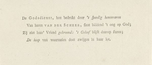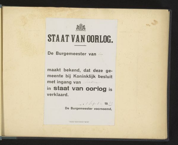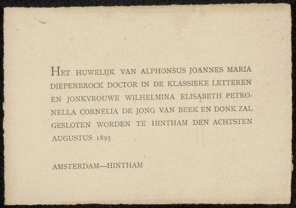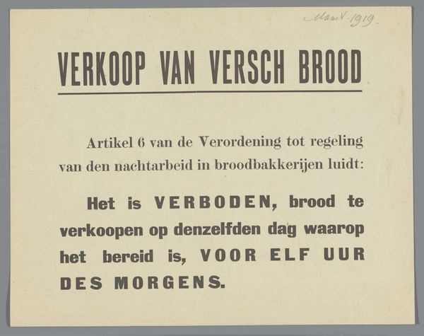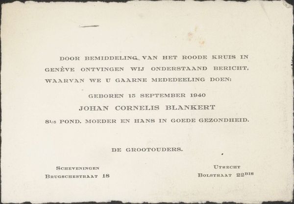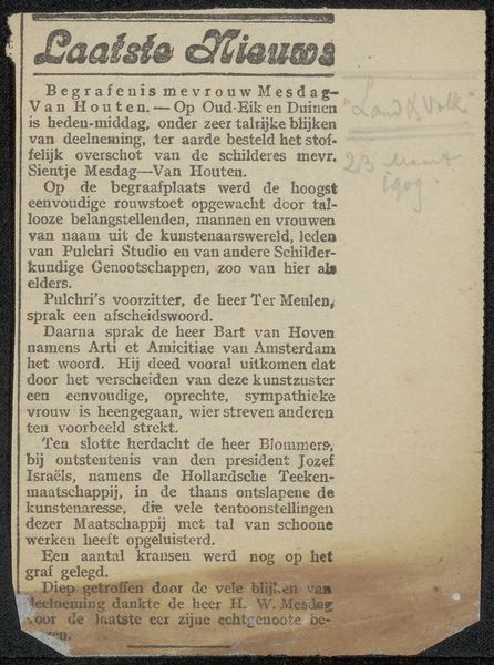
Geboortekaart aan Philip Zilcken en Henriette Wilhelmina van Baak Possibly 1919
0:00
0:00
anonymous
Rijksmuseum
graphic-art, print, textile, paper, typography, poster
#
photo of handprinted image
#
graphic-art
#
type repetition
#
sand serif
#
aged paper
#
art-nouveau
#
script typography
# print
#
old engraving style
#
hand drawn type
#
textile
#
paper
#
typography
#
hand-drawn typeface
#
thick font
#
poster
#
columned text
Copyright: Rijks Museum: Open Domain
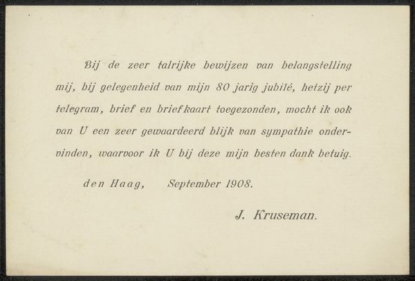
Curator: Well, if it isn’t the picture of understated joy. “Geboortekaart aan Philip Zilcken en Henriette Wilhelmina van Baak,” possibly from 1919, it announces the birth of a baby…how…matter-of-factly. Editor: It’s striking how the aesthetic is so minimalist, isn't it? The careful layout, the unadorned typeface, speaks volumes even without elaborate ornamentation. There’s a certain…starkness, given it is a birth announcement. Curator: Exactly! A far cry from the cherubic chaos of some birth announcements. This feels more like a telegram – joy, but also, 'we've got things to DO!' I bet the parents were the 'no-fuss' types. The texture suggests aged paper; makes me wonder if it yellowed as much from time as from any initial splash of excitement. Editor: That textural aspect, yes, intriguing. Note the sans-serif font, quite modern for the period, wouldn't you agree? The alignment of the text establishes a rigid structure, a formal declaration. Look at how it resists embellishment – the pure functionality here almost becomes the statement itself. Curator: And yet, I sense a human touch, despite the type. I like to think the person arranging the text took a deep breath, feeling that thrill and then thought, "Right, order!" and embraced the design. I’m guessing it’s part of the Rijksmuseum’s collection which… somehow tickles me, that a private family announcement finds its place among Rembrandt. Editor: The Rijksmuseum's framing of the piece imbues it with value but allows the typography to communicate in a distinctive style. If you think about it as a social object, its significance increases. Think of how each carefully selected font creates rhythm within a carefully thought out structure. Curator: Okay, I like the phrase “social object” there… I almost want to imagine, you know, if it still elicits feelings from the descendants of Philip and Henriette! Editor: Well, its real and assumed historical relevance still connects us. As a cultural marker of both family and a time long past, the emotional undercurrent here whispers far more softly than any overt pictorial display could ever have managed.
Comments
No comments
Be the first to comment and join the conversation on the ultimate creative platform.

