Beschrijving van de Italiaanse letter (tweede vervolg) en uitleg over het snijden van de rietpen voor het schrijven van de Italiaanse letter 1608
0:00
0:00
janvandeveldei
Rijksmuseum
graphic-art, print, typography, engraving
#
graphic-art
#
homemade paper
# print
#
text
#
11_renaissance
#
typography
#
hand-drawn typeface
#
engraving
#
historical font
#
columned text
Dimensions: height 260 mm, width 370 mm
Copyright: Rijks Museum: Open Domain
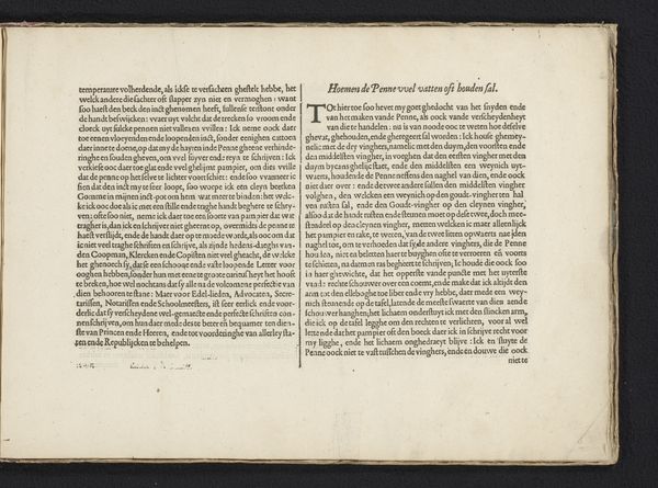
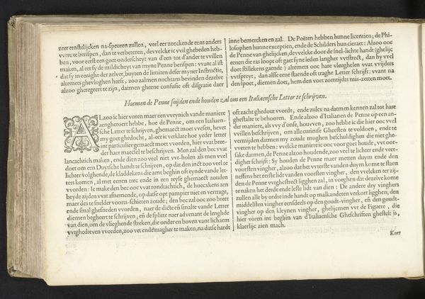
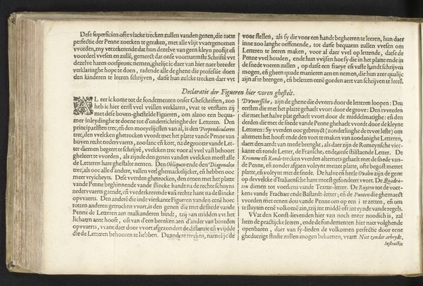
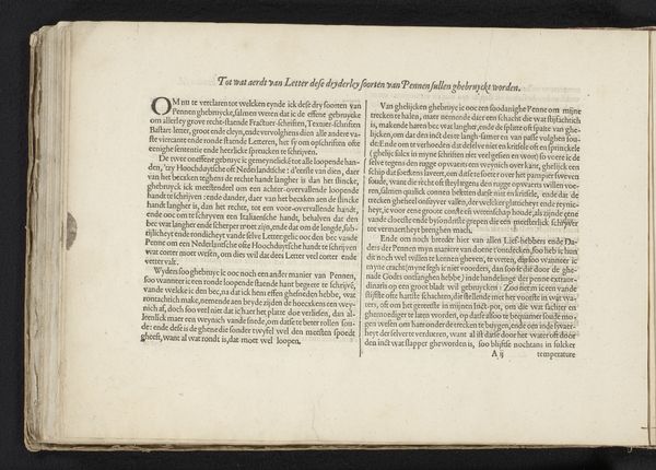
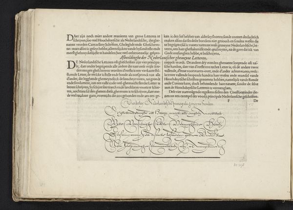
Curator: I think we should start by examining this print currently exhibited in the Rijksmuseum, titled "Beschrijving van de Italiaanse letter (tweede vervolg) en uitleg over het snijden van de rietpen voor het schrijven van de Italiaanse letter" by Jan van de Velde I, dating back to 1608. It presents us with a detailed instructional on crafting an Italian script using a reed pen. Editor: My immediate impression is one of focused craftsmanship. It’s striking how a seemingly simple piece of paper and ink can hold so much potential for disseminating knowledge about lettering techniques. The tight columns and dense text speak to an era where meticulous skill was valued. Curator: Absolutely, and within the context of the early 17th century, this print gains a broader significance. Jan van de Velde was working within a nexus of the Renaissance's humanistic revival of classical forms. The piece reflects not only technical instruction, but also ideas related to literacy, craft traditions, and evolving concepts around social hierarchies as impacted by literacy rates at the time. Editor: It’s compelling to think about how this engraving mediated craft knowledge, essentially democratizing access to specialized techniques, although that access remained primarily available to certain social echelons. Can you tell me a bit more about the process? Curator: Jan van de Velde I was an engraver and printmaker from the Northern Netherlands during the Dutch Golden Age. His background shaped both his aesthetic choices and perhaps also his motivations regarding knowledge distribution through his work. Van de Velde clearly illustrates the tools and the process. He gives precise instructions about the angles, pressure and handling needed. I think it speaks to art production in that period of shifting centers of craft, from guild-controlled production to increasingly market-driven production. Editor: The engraving technique, rendered through incisions into a metal plate, makes me think about the labor involved. The print embodies so many hours dedicated to the careful carving of each letter, making it a valuable object within a burgeoning commercial landscape that both needed, but also perhaps began to dismiss such works in the following eras. Curator: That friction, between preserving tradition and adjusting to new societal roles as information expands, is so important to acknowledge, and that’s part of what makes it continue to resonate today. Editor: Indeed, a remarkable example of instructional craft rendered with attention to method and social change that surrounds the work and its materiality.
Comments
No comments
Be the first to comment and join the conversation on the ultimate creative platform.
More like this