Dimensions: height 65 mm, width 83 mm, height 223 mm, width 130 mm
Copyright: Rijks Museum: Open Domain
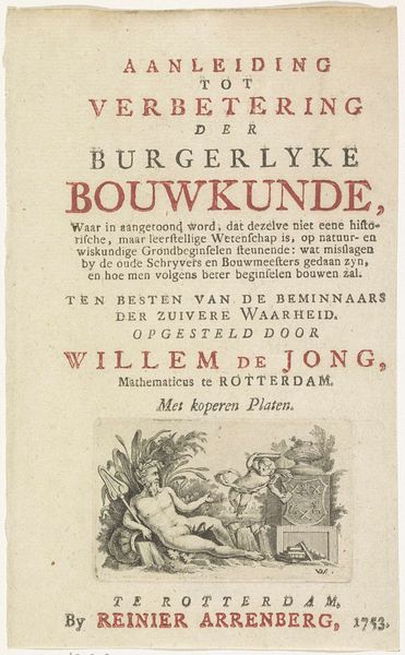
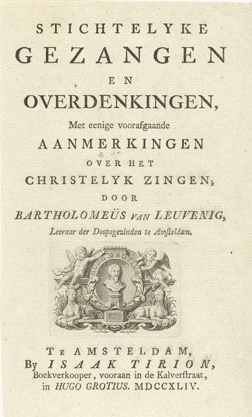
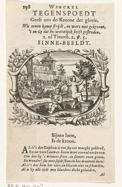
Curator: This print from 1777 serves as the title page for "Stichtelyke gezangen," or "Edifying Songs," a collection of hymns by Rutger Schutte, a preacher in Amsterdam. It combines engraving and typography on paper. Editor: My immediate impression is of delicacy. The figures are airy and somewhat playful, a bit at odds, perhaps, with the 'edifying' title. It gives a sense of lightness despite the seriousness one might expect. Curator: Note how the visual composition borrows heavily from the Baroque, albeit a slightly subdued Dutch take on it. You see cherubs, a woman, likely a muse, and what seems to be a lyre, all traditional elements evoking themes of inspiration, harmony, and, in this context, devotion. The symbolic weight is very deliberate here. The use of established allegories ensures accessibility to its contemporary audience. Editor: Agreed. The choice of monochrome, however, and the delicate etching technique work to soften the Baroque's often opulent drama. Observe the balance achieved in the asymmetry. The rough edges of the paper and faded ink, it almost feels more like an intimate sketch than a formal proclamation. The textures speak volumes about the production and use of printed material from the time. Curator: I’m drawn to the cultural memory this image holds, embedding both the musical and religious sensibilities of its time, suggesting the spiritual significance music held. How songs in the "Italian style" were clearly en vogue! We get insight into the period's cultural values just by analyzing its imagery. The title is, in a very literal way, performing its intended role, opening a door into the 18th century mind. Editor: And, looking at it as an object, there is an interplay between the crispness of the typeface at the top of the print versus the fading detail in the engraved vignette – a reminder that each element requires its own careful appraisal of surface, light, and detail. Curator: A worthwhile reflection; it demonstrates how close study gives one a far greater insight than one would gather in a casual observation. Editor: Indeed, and in focusing on those material details, we find not just the aesthetic, but the artifact speaking for itself.
Comments
No comments
Be the first to comment and join the conversation on the ultimate creative platform.
More like this