graphic-art, print, typography
#
graphic-art
#
aged paper
#
baroque
#
parchment
# print
#
old engraving style
#
typography
#
fading type
#
thick font
#
handwritten font
#
golden font
#
word imagery
#
historical font
#
columned text
Dimensions: height 197 mm, width 154 mm
Copyright: Rijks Museum: Open Domain
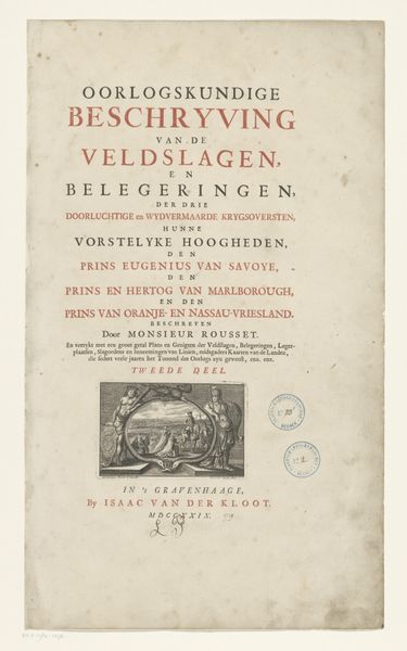
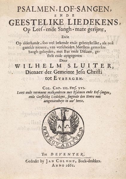
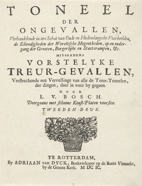
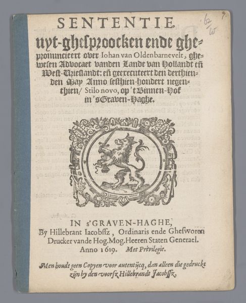
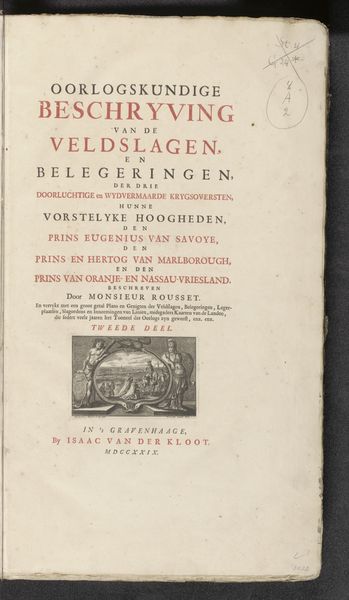
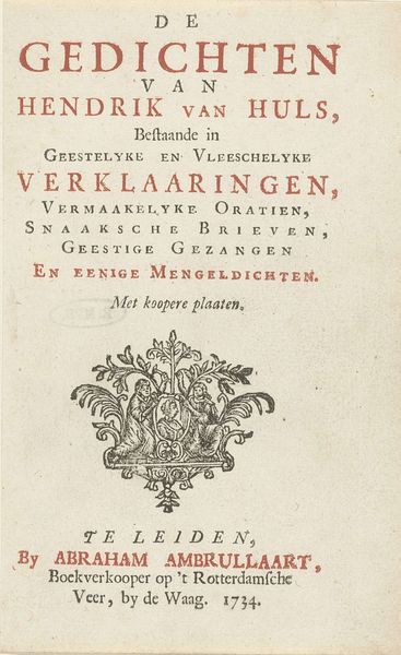
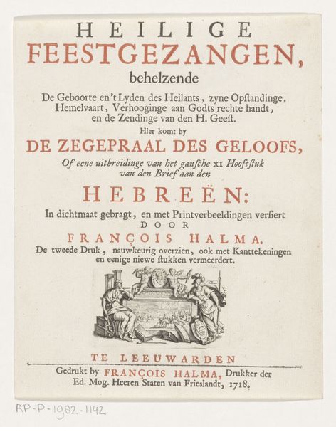
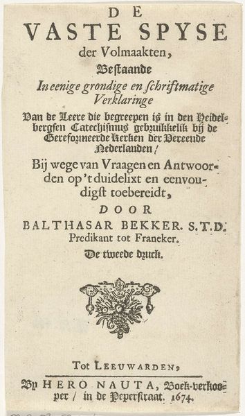
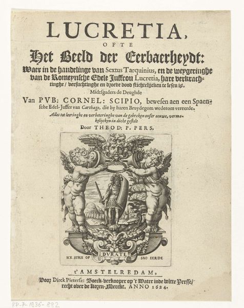
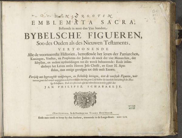
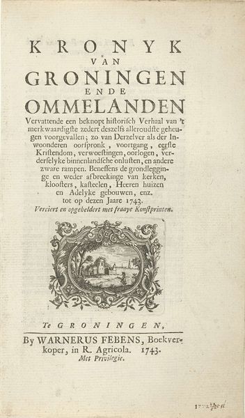
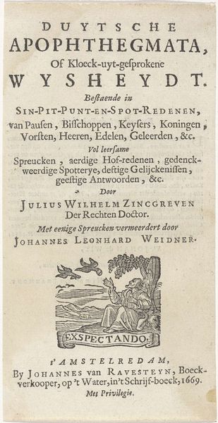
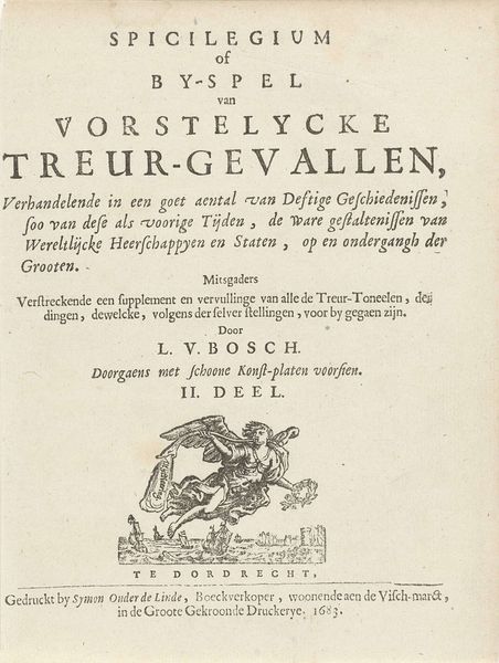
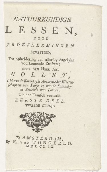
This is a title page from 1749, announcing a book on theology, printed with letterpress. The design is dominated by a rigid vertical structure. Notice how the different blocks of text are arranged in a strict hierarchy, creating a sense of order and formality, typical of the period's aesthetic sensibilities. The choice of typeface, with its varying sizes and weights, reinforces this structure. The prominent use of red for key words like "GODGELEERDHEIT" and "PETRUS VAN MASTRICHT" creates a visual rhythm, guiding the viewer's eye down the page. The symmetrical arrangement of the text blocks around a central axis contributes to the overall sense of balance and harmony. Even the small ornament at the centre, just above the details of the publisher, functions as a point of visual equilibrium, grounding the composition. This focus on structure and form reflects a broader intellectual context, where clarity, order, and reason were highly valued. The title page, therefore, serves not only as an introduction to the book but also as a statement of its intellectual and philosophical underpinnings.
Comments
No comments
Be the first to comment and join the conversation on the ultimate creative platform.
