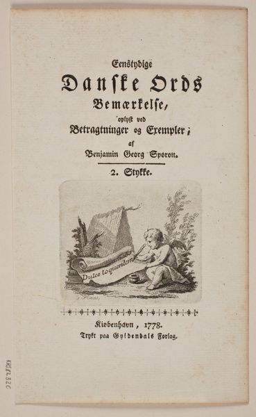
Titelblad til B. G. Sporon "Entydige Danske Ords Bemærkelse" 1807
0:00
0:00
print, paper, typography, engraving
#
neoclacissism
# print
#
paper
#
typography
#
history-painting
#
engraving
Dimensions: 189 mm (height) x 113 mm (width) (bladmaal)
Curator: Looking at this print from 1807, created by Georg Haas, I'm struck by the crispness of the engraving and the rational organization of its elements. Editor: It feels very buttoned-up, doesn't it? Like a perfectly starched collar. A cherubic figure scribbles away in the corner, but the overall mood is… academic? Curator: Indeed. Formally, "Titelblad til B. G. Sporon 'Entydige Danske Ords Bemærkelse'," is exemplary of Neoclassical design. The typography is carefully considered, with variations in font size and weight establishing a clear hierarchy. Editor: Oh, absolutely. The type *is* the star here. The little scene at the bottom, with the kid writing "Dulce loquentem" on a scroll...it's cute, but almost like an afterthought. I'm more drawn to the powerful effect created by the layout, like each word has been meticulously placed. Curator: I concur. Haas masterfully balances textual information with allegorical imagery. The composition utilizes classical motifs such as the writing cherub and draped fabric, imbuing the print with an air of learned authority. It functions both as a title page and as a visual emblem of scholarly pursuit. Editor: It almost feels like an official seal, right? This announces not just the content of the book, but also the gravitas of its author and publisher. And the limitations of its own time of creation—what kind of authority did written word convey when this piece was published? Curator: The piece also speaks to the broader cultural context. Neoclassicism, as a revival of classical aesthetics, often served to legitimize social and political structures, reinforcing ideals of order, reason, and tradition. Editor: That's interesting, especially considering the subtitle is something about “the meaning of unambiguous Danish words”. How wonderfully bureaucratic—establishing a solid linguistic foundation through design. I think this engraving tells us a lot about the value society placed on structured, objective knowledge. Curator: Precisely. Considering how typography contributes to this effect expands the appreciation of the engraving. Editor: I agree, studying this typography shows how effectively information was formatted and passed along at that time.
Comments
No comments
Be the first to comment and join the conversation on the ultimate creative platform.
More like this