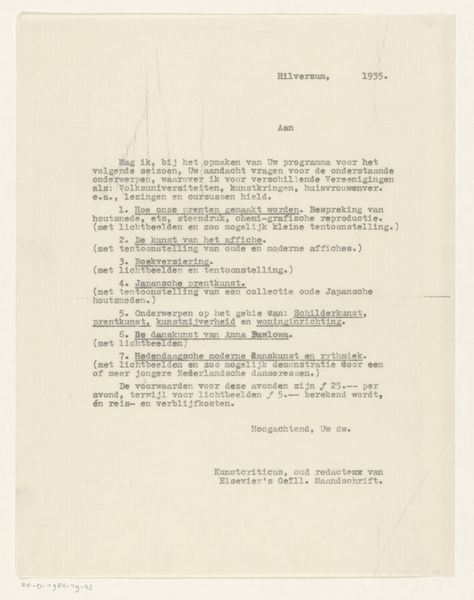
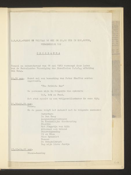
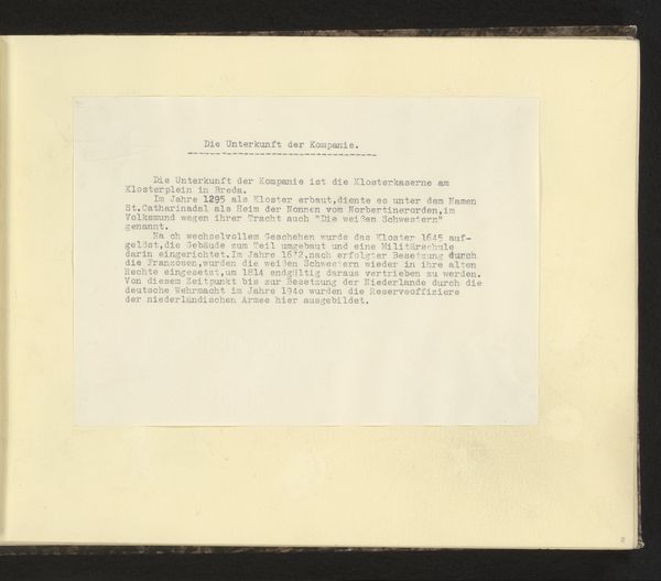
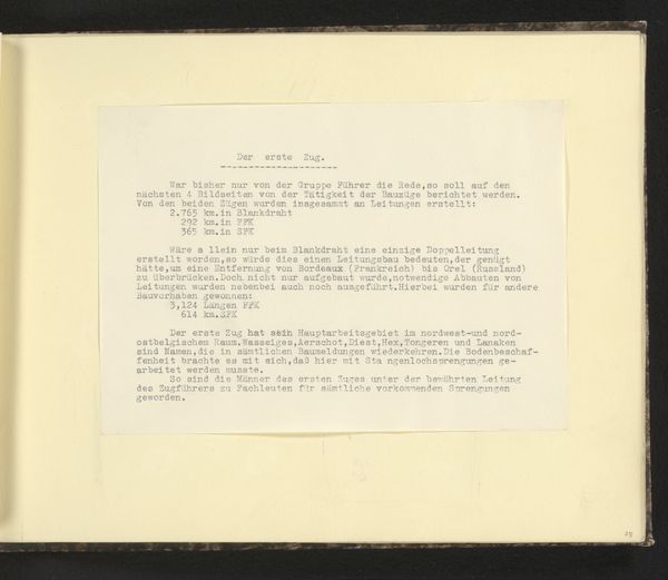
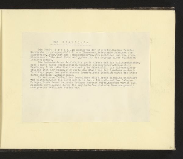
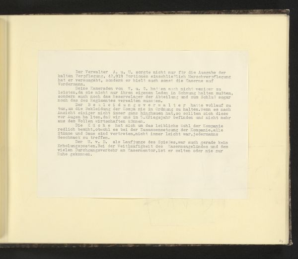
paper
#
script typeface
#
type repetition
#
sand serif
#
script typography
#
hand drawn type
#
paper
#
text
#
fading type
#
thick font
#
men
#
white font
#
handwritten font
#
classical type
Copyright: Vito Acconci,Fair Use
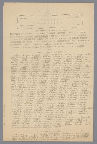
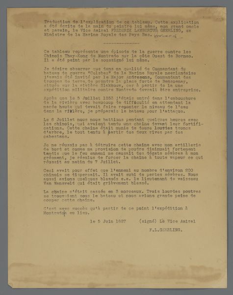
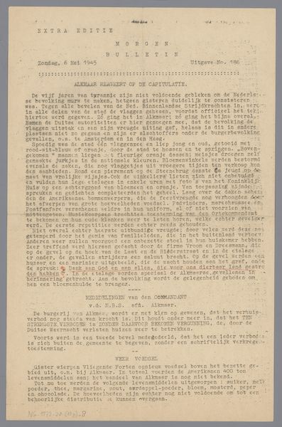
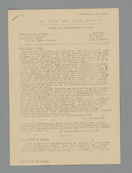
This piece, Nov. 22, 1969; City Series, was made by Vito Acconci, and it's all about process, not just of artmaking but of living, of moving through the city. I love how Acconci uses the typewriter here, it's like a proto-blog post, documenting the everyday in a way that makes you feel like you're there. The starkness of the black ink on that off-white paper really gets me. It's not trying to be fancy, but it's so deliberate. You can almost feel the click of each letter being pressed into the page as Acconci lays out the details of his wanderings around the city, like a detective following a trail. The smudges and imperfections are part of the story, not flaws but evidence of the action, the making. It's easy to see echoes of the French Situationists in this work, with their emphasis on psychogeography, or maybe On Kawara’s date paintings. It's this ongoing conversation about what art can be, how it can capture the fleeting moments of life, even in its most mundane forms.
Comments
No comments
Be the first to comment and join the conversation on the ultimate creative platform.
More like this