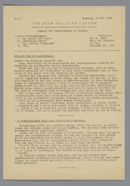
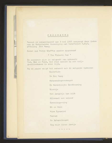
print, typography, poster
# print
#
typography
#
poster
Dimensions: height 250 mm, width 183 mm, height 260 mm, width 185 mm
Copyright: Rijks Museum: Open Domain
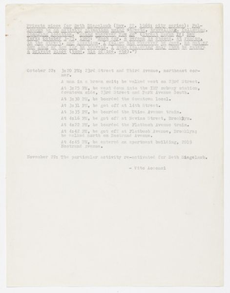
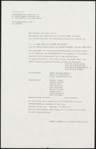
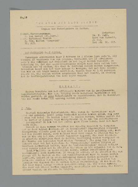
Curator: Look at this ephemeral artifact: a program, printed in 1969, for an evening of theatre and cabaret presented by COC, the Dutch organization for LGBT rights. What springs to mind? Editor: Primarily, I notice the straightforward presentation—the materiality suggests modest production values, possibly a reflection of limited resources, but also perhaps an emphasis on accessibility. It’s not attempting grand artistic statements in its form, rather prioritizing simple communication. Curator: Yes, the plain typography speaks volumes. The type isn’t particularly refined, which serves a specific purpose. The font and layout decisions contribute to its legibility and its clear organizational structure: performances are listed chronologically. The overall effect draws attention to content rather than form. Editor: Absolutely. It's a piece meant to be read and used, not necessarily admired as an object of high art. This links it to the larger context of COC. It gives insight into the work—labor and performance—of an activist community carving out a space for itself, particularly through culture and entertainment. Curator: Note how "The Private Ear," a play by Peter Shaffer, is listed first. Given the performance’s original language, and also given the specific topics COC focused on at the time, it’s very likely that translation and adaption would have to have been applied here. How interesting is it to consider not just the printed object but the creative labour involved in the performances themselves? Editor: Indeed. And think about what the cabaret program entails. Titles such as "Adaptation Ability" and "Dance Permit" suggest subversive, playful acts and references. I’m curious about how it might’ve taken on themes of marginalization and assimilation using comedy and performance. These performances, the print that documents it, all tell us so much about gay liberation. Curator: Yes, by closely observing its textual presentation, and considering typography within the historical era in which this object was created, we start to perceive a visual structure that suggests underlying strategies and intentions for outreach. Editor: Exactly, this document is not only text but is the byproduct of production—queer community-building. It offers a touchable connection to how cultural materials articulate complex stories of resistance and transformation, offering insights far beyond just what’s literally on the page.
Comments
No comments
Be the first to comment and join the conversation on the ultimate creative platform.
More like this