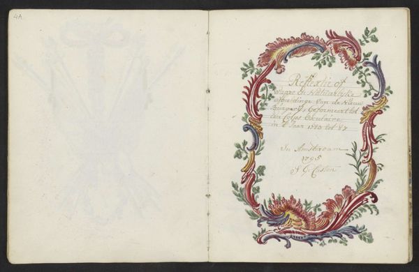
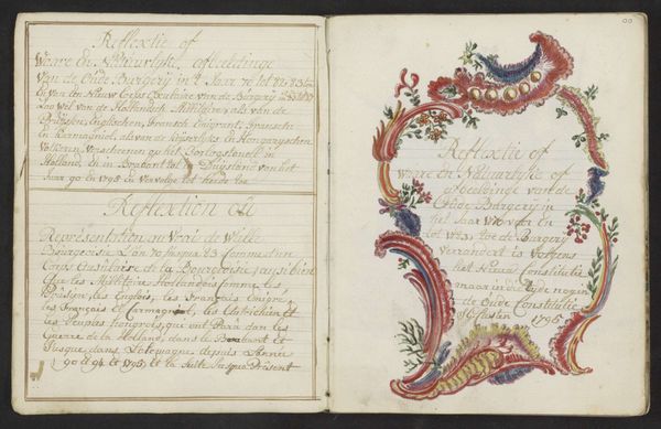
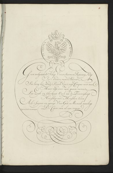
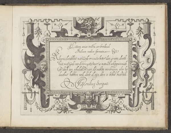
Titel voor het derde hoofdstuk over de nieuwe uniformen na de komst van de Pruisische troepen in 1787 1795 - 1796
0:00
0:00
drawing, paper, ink
#
drawing
#
aged paper
#
pen sketch
#
sketch book
#
hand drawn type
#
personal journal design
#
paper
#
personal sketchbook
#
ink
#
romanticism
#
pen-ink sketch
#
pen work
#
sketchbook drawing
#
genre-painting
#
history-painting
#
sketchbook art
#
calligraphy
Dimensions: height 197 mm, width 310 mm
Copyright: Rijks Museum: Open Domain
Editor: Here we have "Titel voor het derde hoofdstuk over de nieuwe uniformen na de komst van de Pruisische troepen in 1787," a pen and ink drawing on paper by S.G. Casten, made around 1795-1796. I'm immediately struck by the contrast between the faint military imagery on the left page and the elaborate, almost flamboyant script and floral border on the right. What sort of story do you think this page tells us? Curator: This juxtaposition speaks volumes about the socio-political climate of the time. The arrival of Prussian troops in 1787 was a contentious event, marking the end of the Patriot revolt and a restoration of power to the Prince of Orange. The decorative border, seemingly celebrating this "new" order, feels like a performance of stability, a visual rhetoric intended to legitimize Prussian interference and suppress any lingering revolutionary sentiment. Do you notice how the title explicitly refers to "new uniforms"? Editor: Yes, it’s right there in the title, but hadn’t thought of that. Curator: Military uniforms served not just a practical purpose. They also symbolically communicated the might and authority of those who wore them. Casten's work subtly highlights the way imposed symbols such as "new uniforms" reshaped Dutch identity after the Prussian intervention. It makes you wonder about the public role of this sketchbook, or even if it were ever meant for public consumption. Editor: That’s fascinating! So, you're suggesting the visual contrast is less about aesthetic preferences and more about the power dynamics at play? That the decorative element could almost be read ironically, in the context? Curator: Precisely. It compels us to consider whose perspective is being represented, and the complex ways visual culture can reinforce—or even subtly critique—dominant ideologies. These objects can highlight the precariousness of national identity in periods of conflict and upheaval. Editor: I never would have considered those angles on my own. Thank you. It really shifts my understanding of how even seemingly innocuous design choices can carry significant political weight. Curator: And hopefully opens your eyes to how museums and galleries create cultural value in society, and that those institutions inevitably influence perceptions and politics of the visual sphere.
Comments
No comments
Be the first to comment and join the conversation on the ultimate creative platform.
More like this