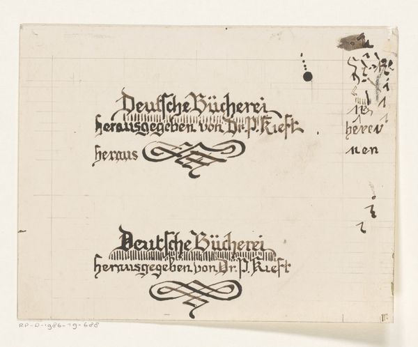
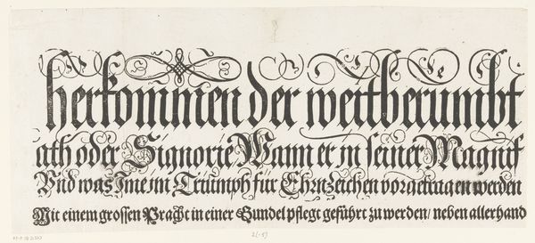
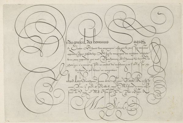
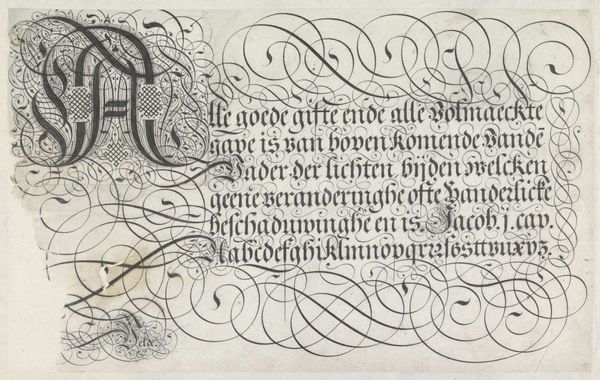
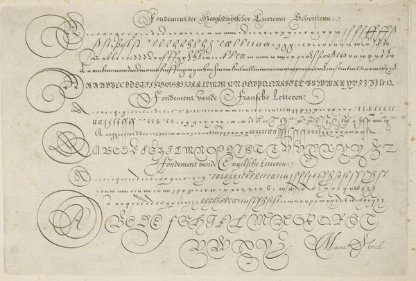
Letterontwerp voor een boek gepubliceerd door dr. P. Kieft 1884 - 1952
0:00
0:00
#
aged paper
#
ink paper printed
#
old engraving style
#
hand drawn type
#
personal sketchbook
#
ink drawing experimentation
#
pen work
#
sketchbook drawing
#
golden font
#
sketchbook art
Dimensions: height 164 mm, width 270 mm
Copyright: Rijks Museum: Open Domain
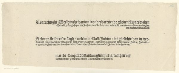
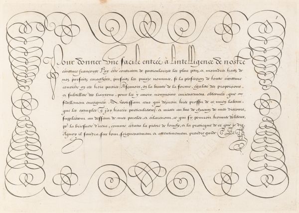
Curator: This is a letter design for a book published by Dr. P. Kieft, crafted sometime between 1884 and 1952 by Reinier Willem Petrus de Vries. It appears to be ink on paper, featuring several variations on a title design. Editor: My immediate impression is that of a medieval manuscript. The heavy, stylized lettering gives it a formal, almost archaic feel, despite its relatively recent creation. The flourishes feel particularly decorative. Curator: It’s fascinating to see the artist experimenting with different variations of the same title. Notice the subtle shifts in the letterforms and the arrangement of the words. The repetitive nature suggests this may have been part of an iterative process, a search for the perfect design. Editor: Absolutely. The composition leads your eye around, comparing and contrasting the distinct presentations of each header. Also, the interplay of light and dark created by the pen strokes gives texture and depth. Curator: And this reminds us about the evolving nature of book design. The development and industrialization of printing technologies greatly shaped and influenced artists and society's demands for standardization, while pieces such as this demonstrate its experimental early years. Editor: I also see the influence of calligraphy here—not just in the letterforms themselves but also in the flourishes and swashes beneath each title. The lines are meticulously drawn, achieving a kind of balance. Curator: I agree. De Vries, like many designers of his era, was clearly engaged with a tradition of meticulous handcraftsmanship, even as industrial printing was rapidly changing the landscape. The calligraphic style, popularized from ancient monastic traditions, speaks to the authority and importance given to literacy during this transitional era. Editor: It’s a lovely example of the convergence between traditional craft and modern design sensibilities. Curator: Indeed. It reminds us to appreciate the historical context surrounding graphic design—a visual artifact reflecting social changes within the society that made it. Editor: Ultimately, this sketch provides unique insight into the intersection of historical conventions and modern practices in a time of monumental shifts for literate societies.
Comments
No comments
Be the first to comment and join the conversation on the ultimate creative platform.
More like this