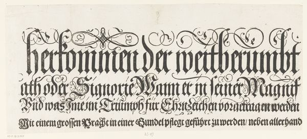
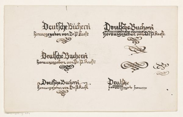
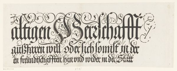
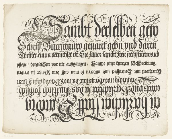
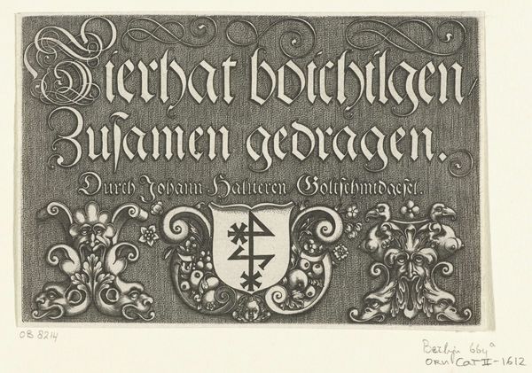
Tekstblad met de titel voor de prent van de overwinning op de Portugese vloot voor Bantam, 1601 1603 - 1610
0:00
0:00
claesjanszvisscher
Rijksmuseum
graphic-art, print, textile, typography, engraving
#
graphic-art
#
aged paper
#
script typography
#
dutch-golden-age
# print
#
old engraving style
#
hand drawn type
#
textile
#
personal sketchbook
#
typography
#
old-timey
#
fading type
#
stylized text
#
thick font
#
handwritten font
#
engraving
#
calligraphy
Dimensions: height 195 mm, width 500 mm
Copyright: Rijks Museum: Open Domain
Curator: Here we have a fascinating engraved text sheet from the Dutch Golden Age, crafted by Claes Jansz. Visscher sometime between 1603 and 1610. The title translates to "Text sheet with the title for the print of the victory over the Portuguese fleet before Bantam, 1601." Editor: Woah, it really has that ancient parchment vibe, right? I love the uneven aging and how it’s got this feeling of whispering stories from way back when, like finding a secret message tucked inside an old book. Curator: Indeed. Visscher uses an engraving technique to inscribe dense black lettering upon what appears to be aged paper. The work presents, in essence, a highly stylized piece of historical typography, functioning almost as an artistic proclamation. We can note the Dutch Golden Age characteristics particularly in its precision and clarity of detail. Editor: I find that calligraphy so striking! How each character is drawn out; very controlled yet with personality! What were these script typography pages actually for, you know, other than making me want to start a pirate themed journal? Curator: These text sheets often accompanied prints depicting historical events or important figures, offering context or commentary. In this case, it seems to introduce a visual representation of a Dutch victory against the Portuguese in Bantam, providing a textual frame. The font style really complements the subject—authoritative but still carrying some calligraphic elegance. The design certainly amplifies the gravity of maritime dominion, fitting for propaganda pieces typical of that era. Editor: Makes you wonder what the print that goes with this was like, too! Still, even without it, this work itself speaks volumes—bold typography against the backdrop of aged paper is very effective! I walked away thinking much about trade and colonialism during that time, all wrapped into this antique design. Curator: Exactly! The choice of medium heightens the impression, inviting the viewer to contemplate both the aesthetic and historical implications ingrained in Dutch maritime achievements during this period. This particular sheet does a wonderful job showcasing a slice of that.
Comments
No comments
Be the first to comment and join the conversation on the ultimate creative platform.
More like this