pop art-esque
cartoon like
cartoon based
studio lighting mockup
vehicle
pop art
comic and comic book
bright colours popping
pop art-influence
cartoon style
cartoon carciture
Copyright: James Rosenquist,Fair Use
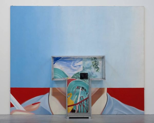
Editor: Here we have James Rosenquist's "Disks," created in 1963. It looks like a painting made up of seemingly unrelated fragments: the front of a car, some records, and a crumpled piece of paper, all in these very vibrant, almost jarring colors. The juxtaposition is so strange. What do you see in the formal composition of this piece? Curator: Initially, note how Rosenquist employs distinct planes. Observe the chromatic tension. The cool, almost metallic car section abuts the bold red field populated with yellow disks. This interplay establishes a powerful visual rhythm, doesn’t it? Are these fragmented elements creating a semantic breakdown of any implied message? Editor: That's interesting! So you're focusing on the pure visual relationships and questioning what the arrangement conveys? Is that why there's so much blank space, to enhance the tension between objects? Curator: Precisely! The negative space, while seemingly empty, serves as a critical structural element. It amplifies the dynamism of the composition, isolating each form, compelling the viewer to actively engage with their relationships—or the *lack* of relationship—at hand. And furthermore to understand the artist manipulation. It is not what is but how it is created! Editor: I never considered the emptiness as a deliberate compositional tool. Thanks, that's something new I have learned! Curator: Likewise! A formal assessment allows us to understand not what objects mean but *how* visual arrangement creates experience.
Comments
No comments
Be the first to comment and join the conversation on the ultimate creative platform.
More like this