Copyright: Ray Parker,Fair Use
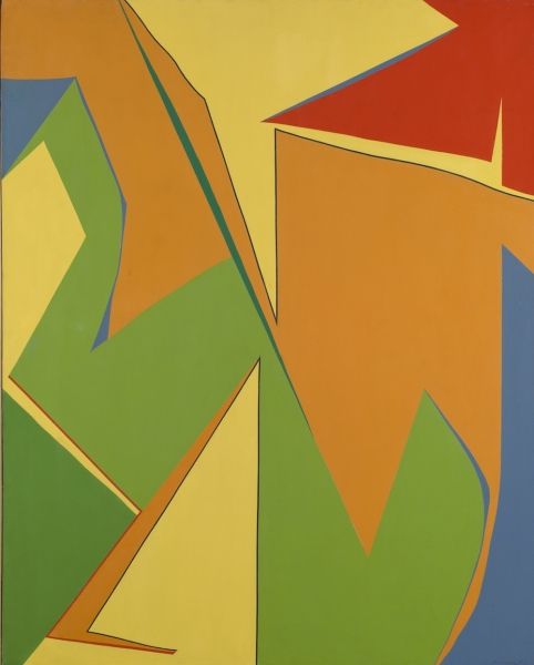
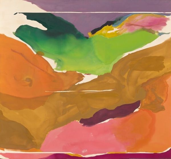
Ray Parker made this untitled painting with acrylic on canvas, and immediately the way the colors sit next to each other grabs you, right? The process feels so exposed, like we're seeing the painting come into being, layer by layer. I love how the flat planes of color create this sense of depth, almost like a stage set, but without any of the shading or traditional perspective we expect. Look at that brown blob nestled between the red and green – it’s like a weird, biomorphic form that’s both grounded and floating at the same time. You can almost feel Parker pushing the paint around, figuring out the relationships between the shapes and hues. The surface is smooth, so he's not interested in texture, it's about colour and form. It reminds me a bit of early work by Helen Frankenthaler, where she was staining the canvas with these luminous washes of color. But where Frankenthaler feels fluid and atmospheric, Parker is more about the graphic punch. It’s all about the push and pull of color, and how these simple shapes can create such a complex and engaging visual experience.
Comments
No comments
Be the first to comment and join the conversation on the ultimate creative platform.
More like this