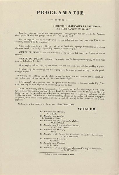
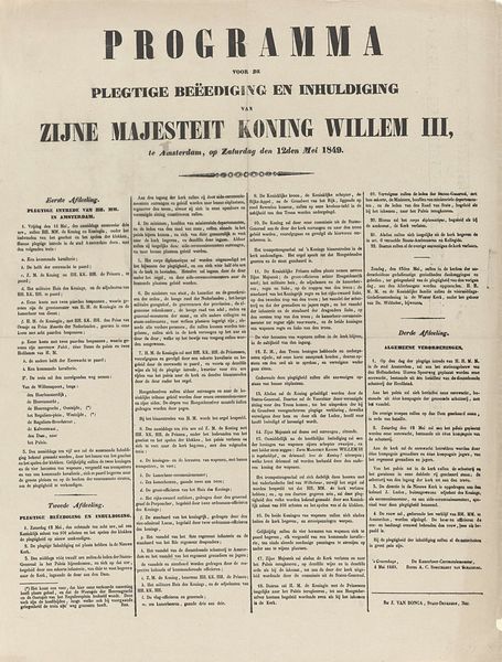
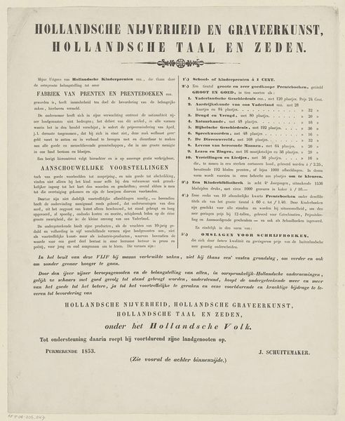
Programma van de begrafenis van Willem III, koning der Nederlanden, op 4 december 1890 1890 - 1892
0:00
0:00
anonymous
Rijksmuseum
print, typography, poster
#
print media
# print
#
typography
#
poster
#
realism
Dimensions: height 433 mm, width 273 mm
Copyright: Rijks Museum: Open Domain
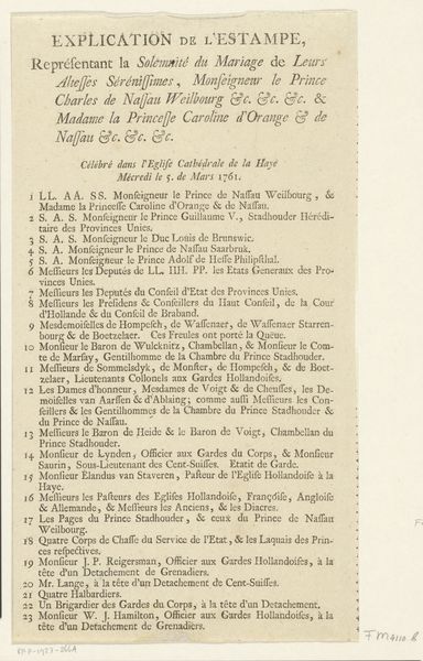
Curator: This rather austere poster lists the order of events for the funeral of King William III. Dating from around 1890 to 1892, this printed broadside offers us a glimpse into the meticulous planning of royal mourning. It’s currently held in the collection of the Rijksmuseum. Editor: Well, it’s certainly not winning any beauty contests, is it? My initial impression is… organized chaos. So much text packed into one place. You almost feel the weight of the occasion just by looking at it, right? A somber formality that practically screams, "Do NOT get the order wrong." Curator: Indeed. Its formalism is precisely its power. Look at the rigorous hierarchy embedded in the typography: larger fonts for the King’s name and title, smaller for the list of participants. Each element adheres to a strict system. It's a textual performance of societal order, a sort of script that meticulously dictates how grief should be publicly expressed. Editor: A textual performance... I like that. But, if you step back from all that royal fussiness, the pure graphic element stands out. It’s almost like a dark rectangle containing these delicate structures. See that heavy black border? It feels almost oppressive, and that thin type floating in the field of paper is surprisingly elegant against that. It adds an extra layer to all that grief that you mentioned earlier. Curator: Certainly. Consider the symbolism too. Print, by its very nature, signifies authority, permanence. A printed program declares a specific sequence, fixed in time, resisting spontaneous expressions of emotion. And consider all those names listed—royalty from across Europe gathered to witness the end of an era. Each carefully positioned name, a symbolic weight in the meticulously ordered structure. Editor: But wasn't the "end of an era" a beginning for someone else? Like a spotlight shifting suddenly in the dark, the poster freezes William's finale but teases with the new chapter unfolding beyond its edge. Each viewer must face that new uncertainty and make way for the changes ahead! Curator: Well put! Reflecting on the piece’s arrangement, I’m reminded of just how much societal values are woven into artistic pieces. It invites analysis of both how information is structured and how societal messages are perpetuated via typography. Editor: Yes. It’s interesting how what appears so rigid on the surface allows room for thought when one views the space it inhabits within larger constructs. This single piece, so functional in intent, can hold different types of visual and artistic interest.
Comments
No comments
Be the first to comment and join the conversation on the ultimate creative platform.
More like this