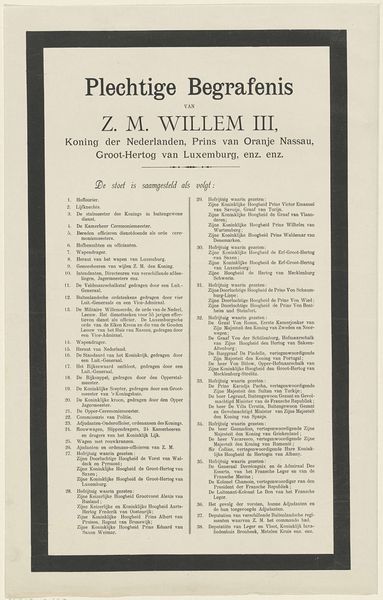
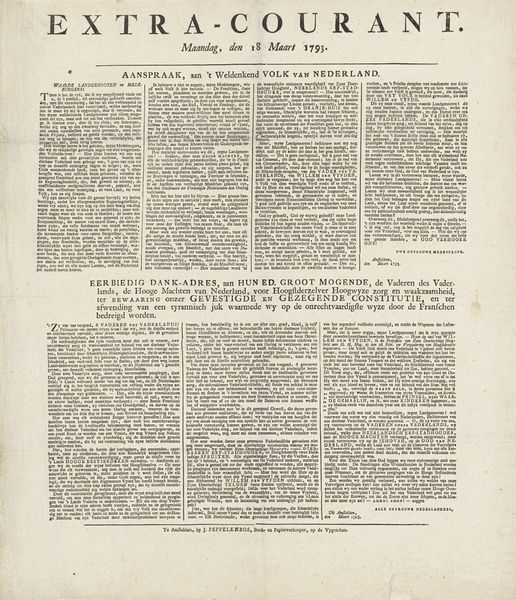
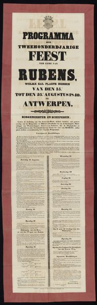
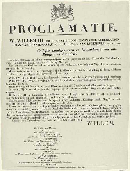
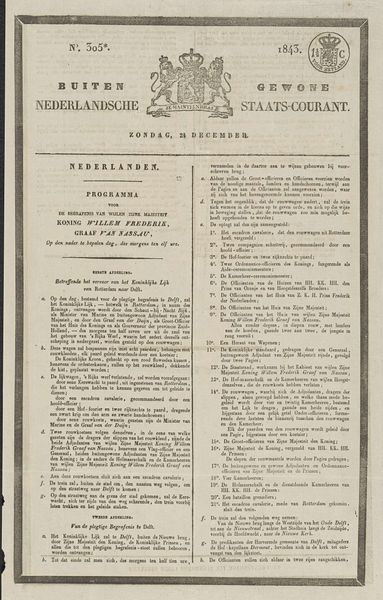
Programma voor de Plegtige Beëediging en Inhuldiging van Zijne Majesteit Koning Willem III, te Amsterdam, op Zaturdag den 12den Mei 1849 1849
0:00
0:00
jvanbonga
Rijksmuseum
print, typography
#
script typeface
#
aged paper
#
hand-lettering
# print
#
hand drawn type
#
hand lettering
#
paragraph style
#
typography
#
journal
#
thick font
#
handwritten font
#
columned text
Dimensions: height 479 mm, width 364 mm
Copyright: Rijks Museum: Open Domain
Curator: So, here we have "Programma voor de Plegtige Beëediging en Inhuldiging van Zijne Majesteit Koning Willem III", a print from 1849. It details the program for King Willem III's inauguration. What are your first impressions? Editor: Well, visually, it looks very text-heavy. Almost like a broadside. The typography, with those heavy, almost hand-lettered fonts, is striking against the aged paper. It gives off an official, historical feel, but it’s also quite utilitarian. What strikes you about its materiality and context? Curator: The immediate thing I notice is its production – the printing itself. Consider the labour involved in setting that type. Each letter, each word, carefully placed to disseminate information about this key political event. It highlights the connection between power, information and the means of its distribution. What does the use of typography itself convey in this piece? Editor: It’s interesting you point that out. It almost seems at odds. A program usually has a slick design now, but back then, it’s all about efficiently conveying information to a wide audience through printed matter. Is there any attempt at elegance despite the mass-produced nature? Curator: Elegance is embedded in the formality of the script, don't you think? Yet, you are right to say it’s aiming for efficiency. This wasn't necessarily intended as a treasured object but more as a disposable tool for understanding the event’s schedule. We should think about who made this program; where and how this print was originally made. Editor: I see your point. By understanding the processes and materials of its creation, we learn about how political power was displayed and distributed to the people at that specific moment. It emphasizes access and information rather than purely aesthetics. Curator: Exactly. Looking at the details – the specific typeface choices, the layout of the text blocks - lets us trace how this tangible object reflects broader societal values. It is a simple print with complicated and far-reaching social meaning.
Comments
No comments
Be the first to comment and join the conversation on the ultimate creative platform.
More like this