graphic-art, print, typography, poster
#
graphic-art
#
art-nouveau
#
script typography
#
hand-lettering
# print
#
old engraving style
#
hand drawn type
#
hand lettering
#
typography
#
hand-drawn typeface
#
hand drawn
#
pen-ink sketch
#
limited contrast and shading
#
pen work
#
decorative-art
#
poster
Dimensions: height 133 mm, width 105 mm
Copyright: Rijks Museum: Open Domain
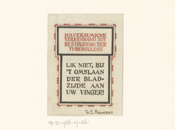
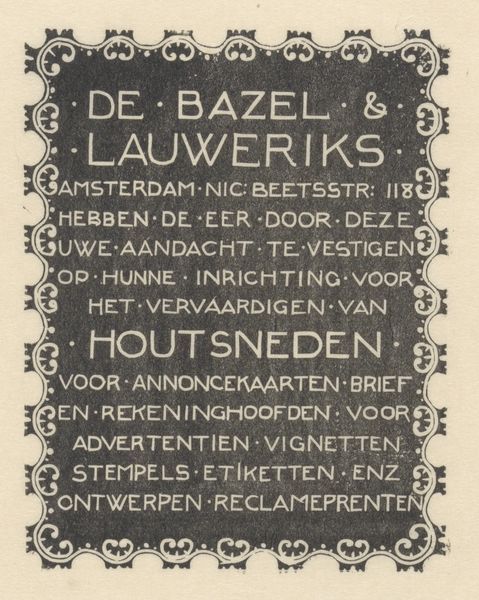
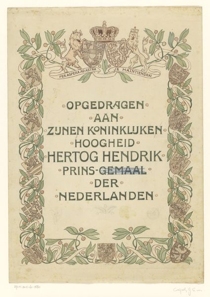
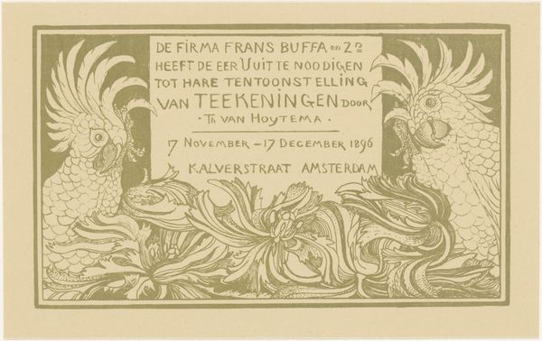
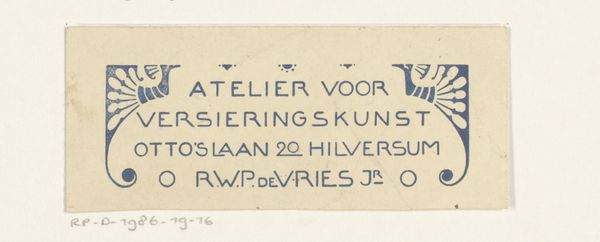
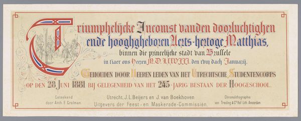
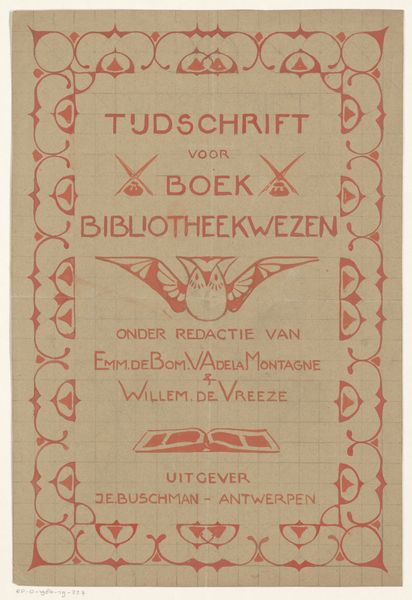
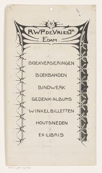
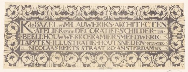
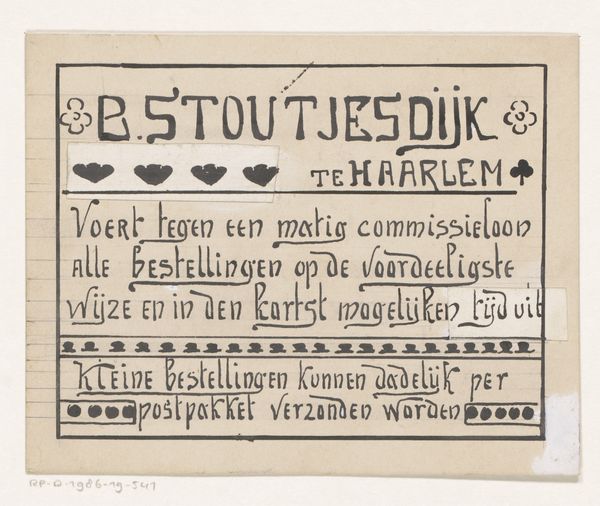
Editor: This is "Advertentie van H. Wegerif," a poster created sometime between 1874 and 1935 by Mathieu Lauweriks. It seems to be a print of some kind, possibly a woodblock. It’s striking how the lettering becomes the image itself, the words heavy and monumental. What draws your eye when you look at this? Curator: The entire composition speaks of memory. Lauweriks uses lettering not merely as text, but as a visual echo of stone inscriptions, reminiscent of headstones. Consider how the serifs, blocky and pronounced, imitate chiseled edges. Editor: I see that now. There’s a solidity to the text that almost makes it feel three-dimensional. Curator: Exactly! It transforms the advertisement into a lasting monument. Look at the stylized floral motifs intertwined with the lettering. What do they evoke for you? Editor: A sense of delicate beauty amidst the heaviness of the words. Is it meant to soften the subject matter, do you think? Curator: Perhaps. The combination suggests the enduring nature of memory, finding beauty even in the face of mortality. It uses symbolism to subtly sell a product while speaking to something deeper about how we commemorate life. How do you think viewers at the time may have interpreted it? Editor: Probably more attuned to those visual cues than we are now. I’m starting to appreciate how typography can be so much more than just conveying information. Curator: Indeed. Lauweriks crafts a message deeply rooted in visual language, making this piece a poignant reflection on how we preserve and celebrate memories.
Comments
No comments
Be the first to comment and join the conversation on the ultimate creative platform.
