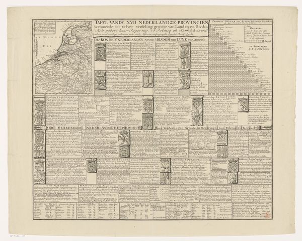
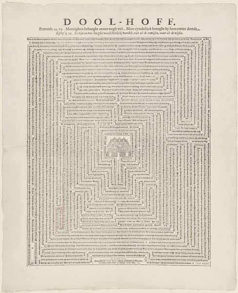
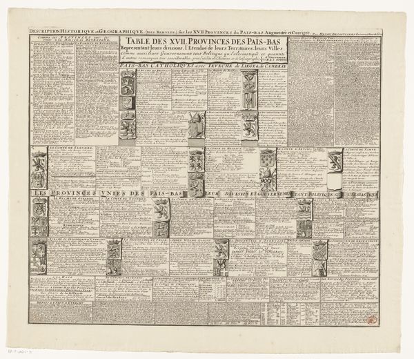
Afstandstabel voor belangrijke steden uit de Zeventien Provinciën en prinsbisdom Luik tot aan Parijs 1686 - 1725
0:00
0:00
abrahamallard
Rijksmuseum
graphic-art, print, engraving
#
graphic-art
#
dutch-golden-age
#
ink paper printed
# print
#
old engraving style
#
geometric
#
line
#
engraving
Dimensions: height 490 mm, width 579 mm
Copyright: Rijks Museum: Open Domain
Editor: So, this is Abraham Allard's "Afstandstabel voor belangrijke steden uit de Zeventien Provinciën en prinsbisdom Luik tot aan Parijs," dating from 1686 to 1725, a print on paper. It looks like an elaborate chart. What's your take on what it represents and why it was created? Curator: It's a fascinating piece that speaks volumes about the economic and political landscape of the Dutch Golden Age. These distance tables weren’t merely geographical tools; they were instruments of power and commerce. Consider how trade guilds and emerging nation-states needed to efficiently manage logistics, taxation and even military deployment. The visual presentation itself–organized with geometric precision – reflects the Dutch Republic's obsession with order, rationality and control of information, wouldn’t you agree? Editor: That's a very different way to see it. I thought it was more about exploration and way-finding. Are you saying it's more about bureaucratic control? Curator: Absolutely. Think about the role of maps in establishing territorial claims and projecting influence. These ‘distance tables’ would have circulated among merchants, diplomats, and administrators as essential guides that visually assert authority and reinforce commercial ties to Paris. It invites us to critically question who held this knowledge and for what ends? Editor: So, it’s not just a chart; it's a statement about power and the control of information within the political system. I'd never have considered it in that context. Curator: Precisely. By viewing it within its historical setting, it transforms from a simple table into an active artifact shaping political and economic interactions of its era. Editor: That's incredibly insightful. I see it now! Thank you for expanding my perspective. Curator: My pleasure. It highlights how much context shapes our interpretation of even seemingly straightforward visual data.
Comments
No comments
Be the first to comment and join the conversation on the ultimate creative platform.
More like this