print, textile, paper, typography
#
dutch-golden-age
# print
#
textile
#
paper
#
typography
Dimensions: height 387 mm, width 213 mm
Copyright: Rijks Museum: Open Domain
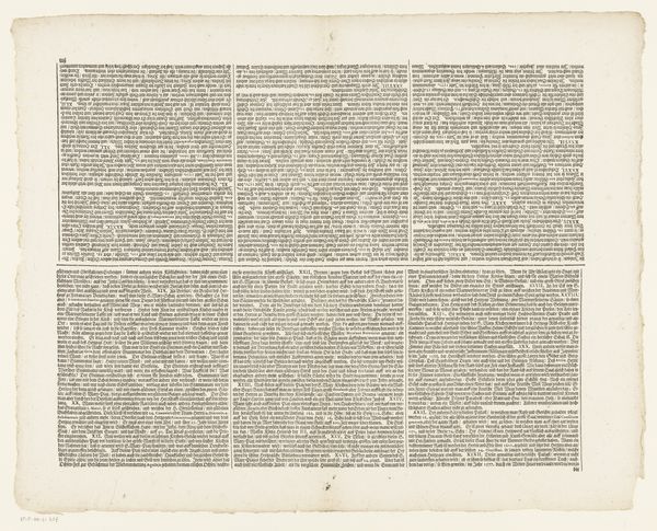
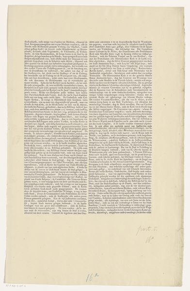
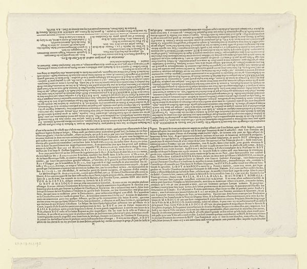
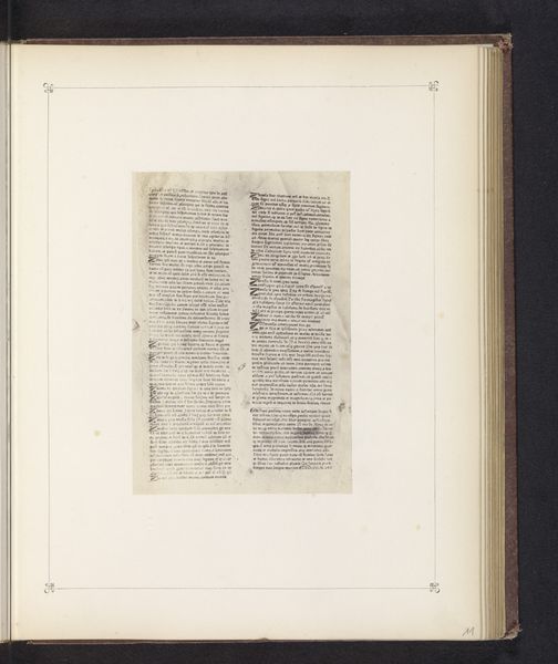
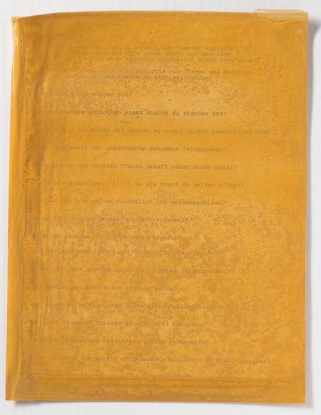
Curator: Good morning. Here we have "Deel van een beschrijving van de stad Haarlem in dichtvorm," a print dating back to 1641 by Samuel Ampzing. It’s part of a longer description of the city. Editor: Well, my first impression is...overwhelming! So much text. Dense and tightly packed, it feels like a wall of information. Curator: Precisely. Note the dedication to typography as form. Ampzing, typical of Dutch Golden Age printed work, meticulously organized the text, presenting the description of Haarlem as both literature and visual experience. The very act of reading becomes an act of seeing, of observing a constructed space. Editor: It does feel spatial in a strange way, like lines of streets maybe. I am drawn to the structure, though, seeing it almost like a city plan rendered through text rather than graphics. The black text on the aged paper provides a stark contrast that emphasizes this linearity. Curator: Yes, think of it as more than mere lettering. In its historical context, the piece reflects the booming print culture of the time, a moment of burgeoning literacy. This democratization of knowledge was inherently tied to social mobility, and the image’s textual density speaks to an almost zealous embrace of accessible information. The poem, therefore, speaks of Haarlem, and of access, and of progress. Editor: The presentation of such details highlights how crucial these printed descriptions were for shaping urban identities and civic pride. In a world still largely governed by oral tradition and limited mobility, the circulation of these descriptions provided individuals with an unprecedented way of conceiving of, and relating to, urban spaces. This allowed Haarlem to position itself amongst other cities of that era. Curator: I concur completely. By carefully examining the textual composition and the role of the printed word in the early modern era, we discover how something seemingly straightforward holds complexities, reflective of its socio-historical importance. Editor: It makes me rethink how typography, at that time, played not only with conveying a message, but helped to establish communal meaning and civic identity during an incredible time for The Netherlands and it's Golden Age.
Comments
No comments
Be the first to comment and join the conversation on the ultimate creative platform.
More like this