drawing, print, paper, ink
#
portrait
#
drawing
#
hand written
#
script typography
#
hand-lettering
#
dutch-golden-age
# print
#
hand drawn type
#
hand lettering
#
paper
#
personal sketchbook
#
ink
#
hand-drawn typeface
#
sketchbook drawing
#
sketchbook art
#
calligraphy
#
small lettering
Copyright: Rijks Museum: Open Domain
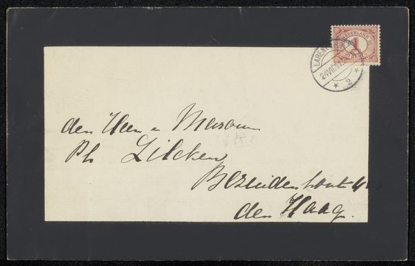
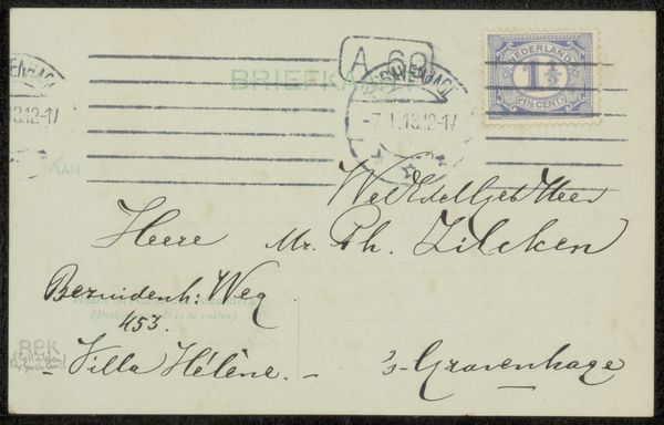
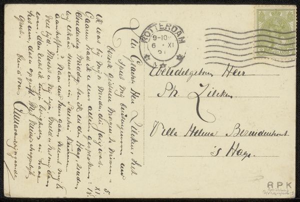
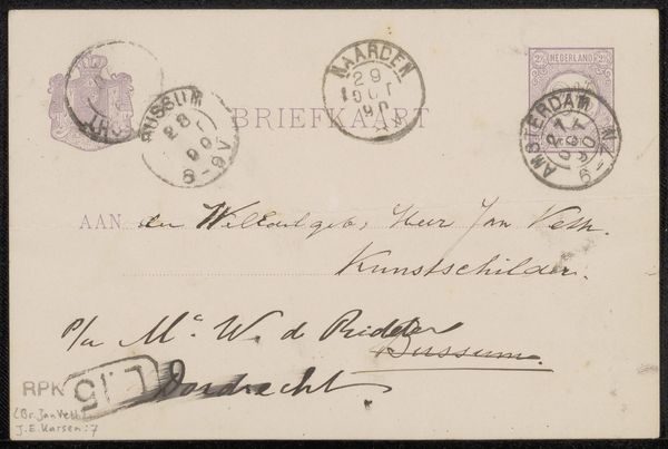
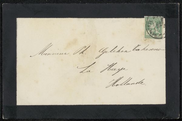
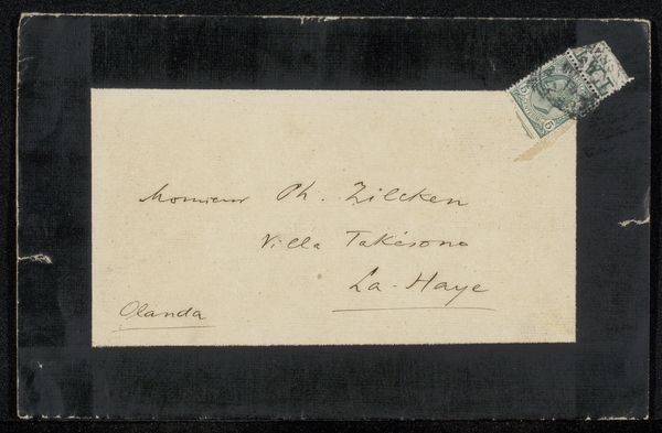
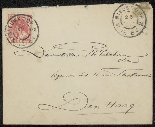
This envelope addressed to Philip Zilcken was made by François de Bas. It’s all lines and marks, like a drawing made with a pen, but it's also an object that has traveled, from one place to another, carrying a message. The handwriting loops and dances across the surface, a bit like a Cy Twombly scribble, only much more controlled. Everything is contained within a grid made from a stamp, address and franking mark. What I like about this is how it manages to be both casual, and formal at the same time. Look at the flourish under the name, see how the artist takes a line for a walk and creates a kind of graphic full stop to the communication. It reminds me that art is simply a kind of advanced communication, and that even the smallest gesture can have a big impact. The whole thing feels very Dutch to me, maybe it’s the light, maybe it’s the simplicity, or maybe it's the ghost of Mondrian.
Comments
No comments
Be the first to comment and join the conversation on the ultimate creative platform.
More like this