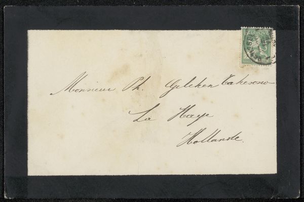
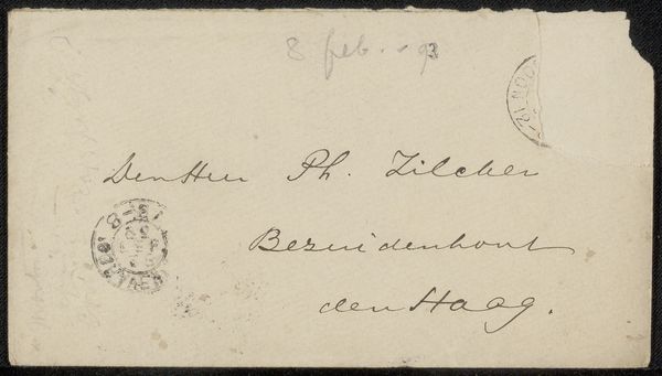
drawing, paper, ink
drawing
paper
ink
calligraphy
Copyright: Rijks Museum: Open Domain
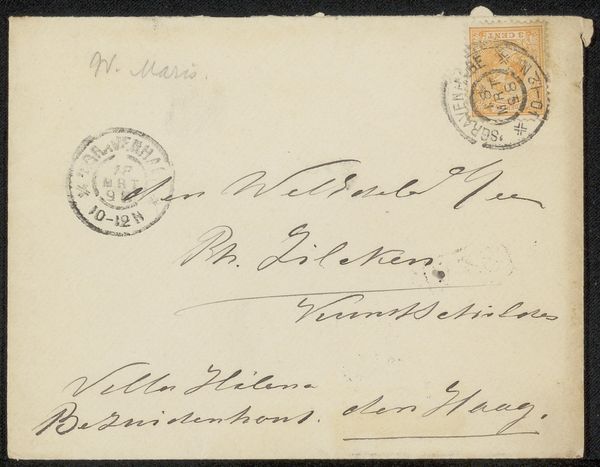
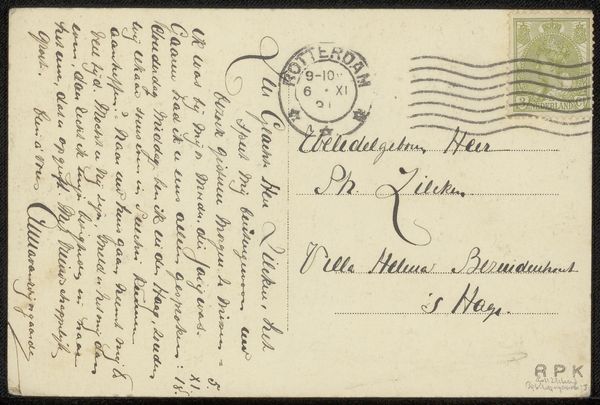
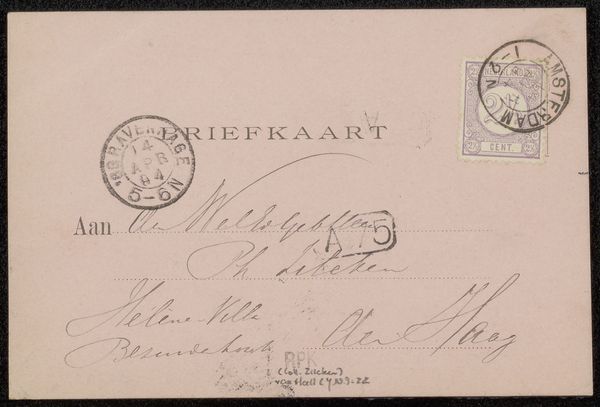
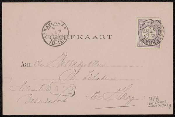
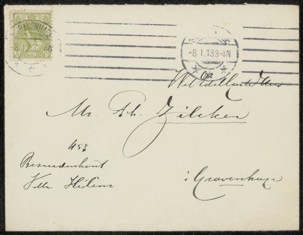
Curator: Here we have "Envelop aan Philip Zilcken," a pre-1905 drawing by Waalko Jans Dingemans. It's ink on paper. Editor: It appears deceptively simple, but the flowing script across the off-white paper exudes a certain elegance. It feels almost like a dance, those lines connecting and swirling. Curator: Precisely! The calligraphy, while functional as an address, elevates the mundane into an art form. Note the deliberate contrast between the thick downstrokes and the delicate hairlines. Editor: And consider the societal implications! Back then, penmanship was more than a skill, it was a marker of status, education. This envelop suggests something about the relationship between the sender and recipient. What do you read from that? Curator: Absolutely, but look closer! The stamps aren't just postage, they're compositional elements anchoring the text. The graphic weight and circular design of stamps are strategically balanced with calligraphic form of handwriting Editor: And don't forget the paper itself. The texture, the slight imperfections—they speak to the physical realities of communication before email, the weight of the letter, the act of sending. I bet you this Zilcken felt quite flattered by Dingemans. What type of bond might that speak to? Curator: Indeed. It's a tangible link to a specific moment in time. This wasn't just a message. It was a material expression, and, aesthetically a carefully planned two dimensional tableau. Editor: So, much more than just a utilitarian object discarded after delivery. A silent messenger bridging social context and personal gesture. Curator: Precisely. It encourages one to examine art’s capability to transform daily ephemera into lasting artistic experience.
Comments
No comments
Be the first to comment and join the conversation on the ultimate creative platform.