drawing, paper, ink, pen
#
drawing
#
pen sketch
#
paper
#
ink
#
ink drawing experimentation
#
pen-ink sketch
#
pen work
#
sketchbook drawing
#
pen
#
calligraphy
Copyright: Rijks Museum: Open Domain
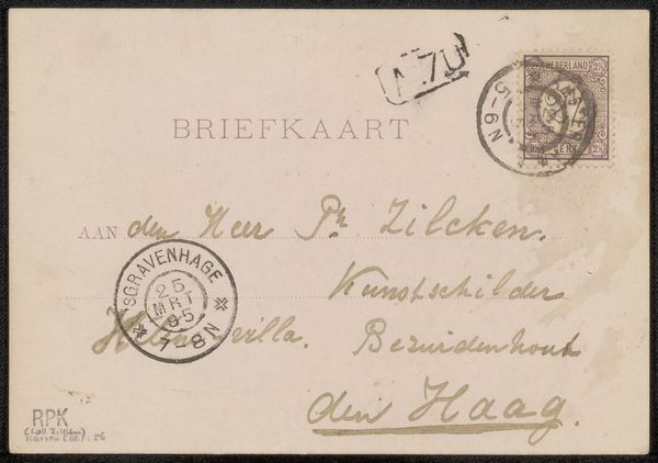
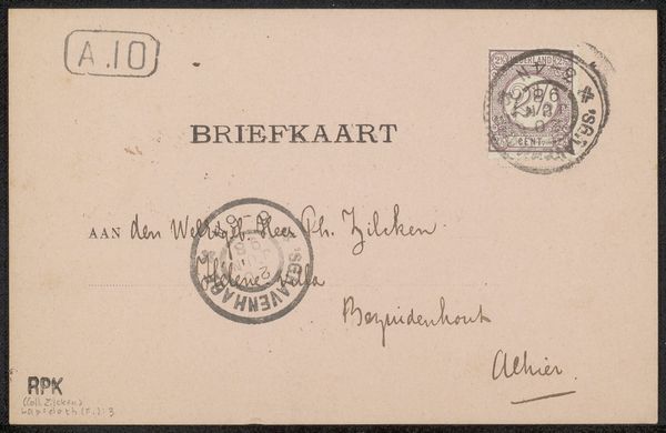
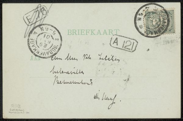
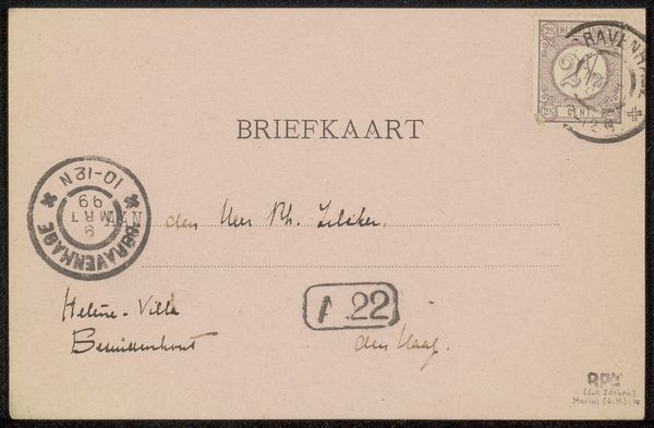
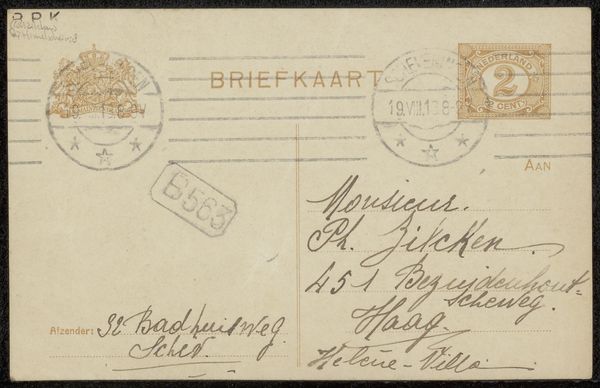
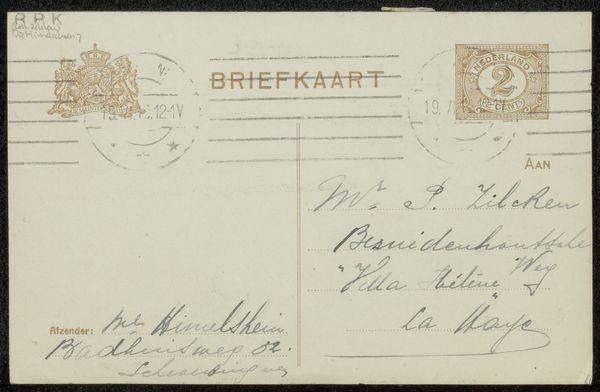
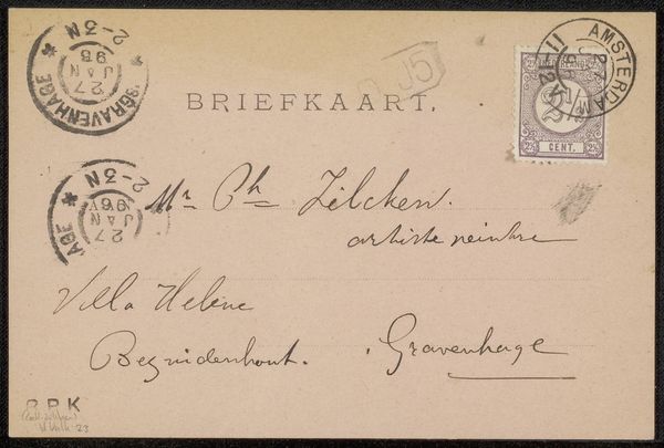
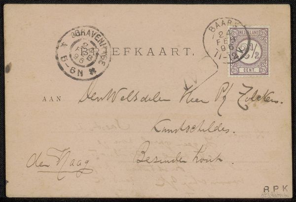
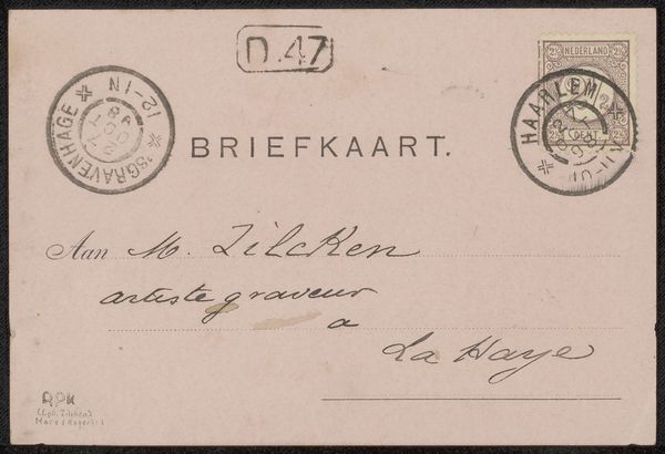
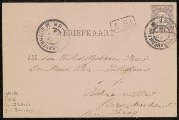
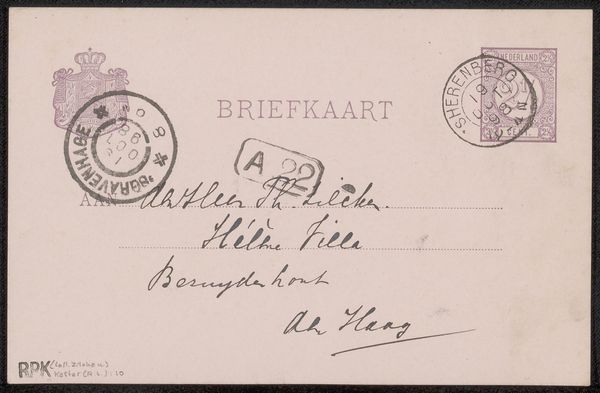
Editor: This is "Briefkaart aan Philip Zilcken," a pen and ink drawing on paper by Grada Hermina Marius, made before 1899. There's something intriguing about seeing the back of an old postcard, almost like a peek into a different time. I'm struck by the formal balance between the handwritten script and the official stamps. How would you approach this from an artistic perspective? Curator: Formally, the arrangement is quite striking, isn't it? Consider the relationship between the textures created by the calligraphic handwriting and the geometric rigidity of the printed "BRIEFKAART" heading, and the circular stampings. These textural and patterned relationships create a visual cadence. Editor: I hadn't thought about the texture so much. The stampings almost look like abstract shapes competing with the writing. Curator: Precisely. Consider also the weight of the ink. Marius uses varying pressure to create thick and thin lines, adding depth and contrast. Observe how the flourishing signature interacts with the stark, blocky letters above. Are they in harmony, or are they purposefully clashing? And note, there is also an interplay between positive and negative space here. Editor: That contrast makes it more dynamic. So it's about the formal arrangement of the different elements on the card and how they interact visually. I can see that there is something to be appreciated beyond just its historical significance. Curator: Exactly. While the card itself served a utilitarian function, its design elevates it to a study of form. Even without understanding the message, we can appreciate the considered composition. Editor: This really gives me a fresh pair of eyes to examine something I thought of as a simple postcard. Thanks!
Comments
No comments
Be the first to comment and join the conversation on the ultimate creative platform.
More like this