drawing, mixed-media, paper, ink
#
drawing
#
mixed-media
#
pen drawing
#
pen illustration
#
pen sketch
#
old engraving style
#
paper
#
personal sketchbook
#
ink
#
ink drawing experimentation
#
pen-ink sketch
#
pen work
#
sketchbook drawing
#
sketchbook art
#
calligraphy
Copyright: Rijks Museum: Open Domain
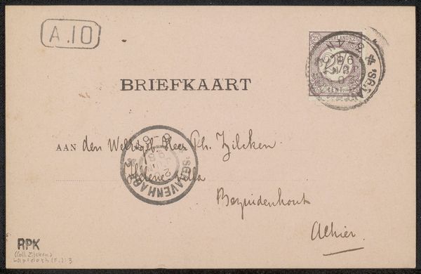
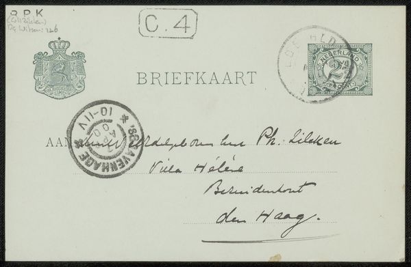
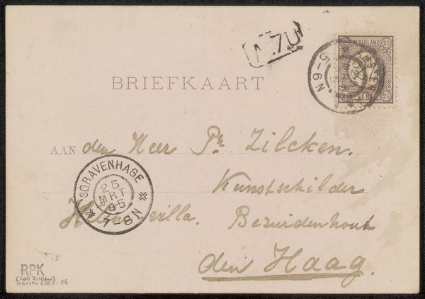
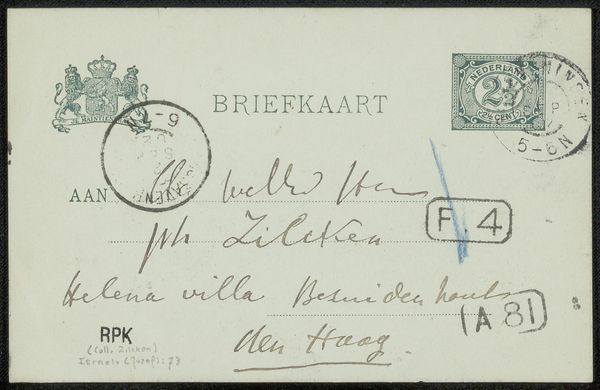
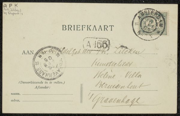
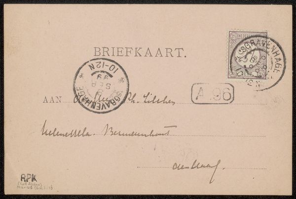
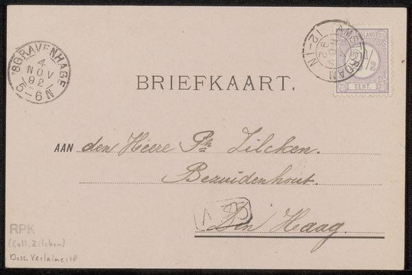
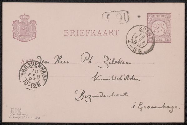
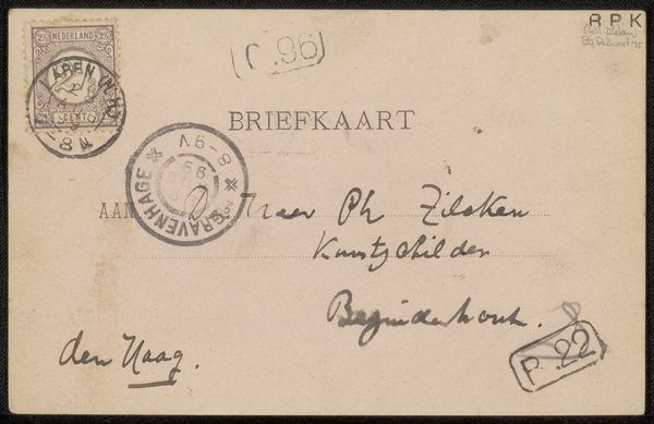
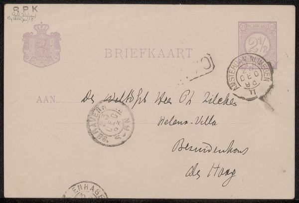
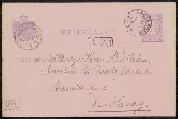
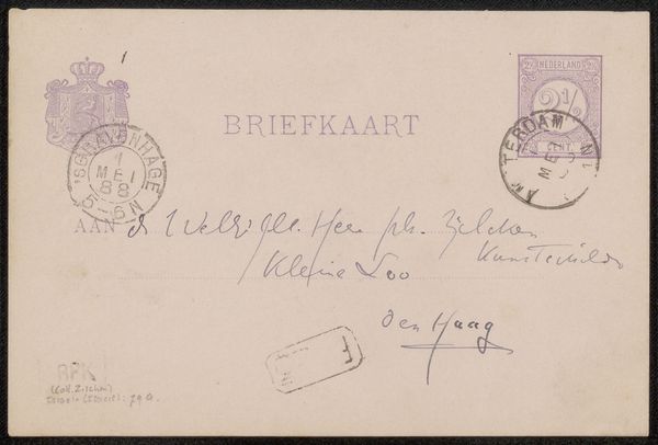
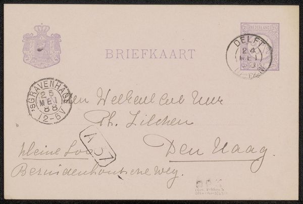
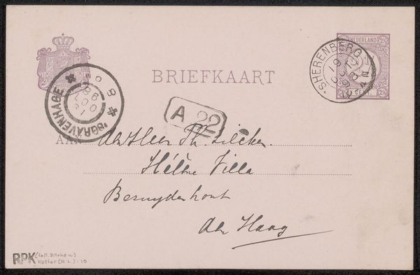
Grada Hermina Marius created this vintage postcard to Philip Zilcken, the artwork's muted palette of greys, blacks, and creams evoking a sense of nostalgia. The card's composition is defined by text elements, handwritten notes, stamps, and postmarks, distributed across its surface. The arrangement presents a structured yet informal layout, reminiscent of early 20th-century communication aesthetics. It brings up semiotic inquiry, where each mark functions as a signifier. The typography of "BRIEFKAART" is in a serif typeface, a sign of the era's printing conventions. Handwritten script introduces a personal touch, contrasting with the mechanical precision of the stamped elements. The postmarks, with their circular forms and radial text, act as visual anchors, providing a framework to consider how communication technologies shape personal interaction. This postcard is not just a means of conveying a message, but also becomes a canvas that captures time and its aesthetic codes, offering a lens through which to see the intersection of public and private expression.
Comments
No comments
Be the first to comment and join the conversation on the ultimate creative platform.
