drawing, paper, ink
drawing
paper
ink
Copyright: Rijks Museum: Open Domain
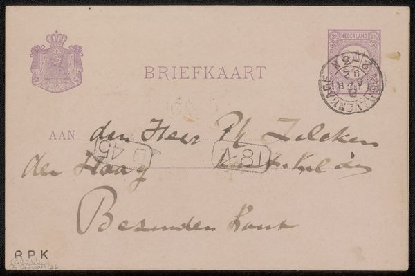
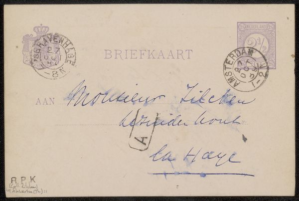
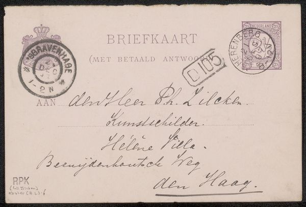
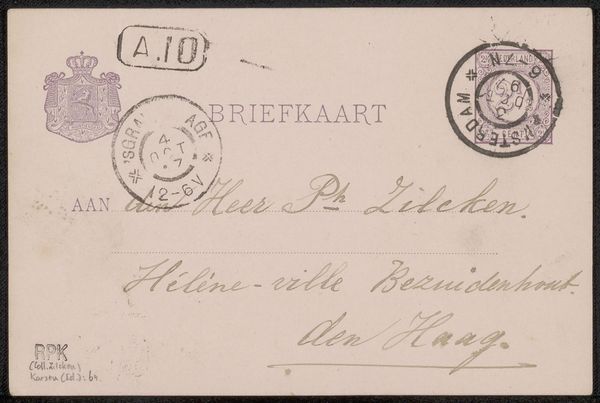
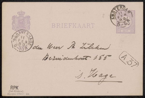
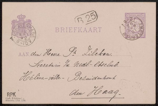
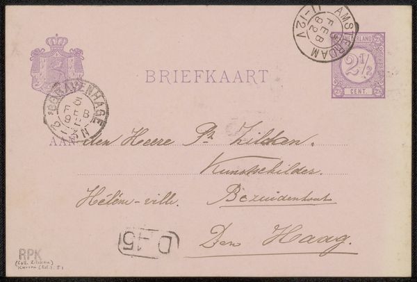
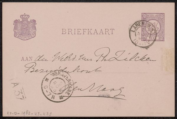
Curator: Well, isn't this charming? We're looking at "Briefkaart aan Philip Zilcken," a postcard created before 1891 by Eduard Karsen. It’s ink on paper. Simple materials, a world away. Editor: It strikes me as incredibly delicate. The light pink of the card, the faded ink… It’s a whisper from another time. Almost mournful, would you say? Curator: Mournful, perhaps touched by a quiet introspection. But observe, there’s also a formalism at play here. The careful balance between the printed text, the handwriting, and the stamps creates a delicate interplay of textures and forms. Note the geometrical stamp versus the fluid cursive of the address. Editor: You always see structure where I see soul! Look at the slant of the handwriting. It’s like the message itself is leaning into the future, reaching out. Who was Philip Zilcken? What was the 'Nederlandse Etsclub' all about? My mind races with possibilities. Curator: Ah, context. Zilcken, an etcher, a contemporary of Karsen. That club likely a vibrant artistic circle. Still, remove those anecdotal elements, and you are left with composition: the stamps punctuate the composition in the upper right and left register in dialogue with the text. Editor: I get it, you're saying the composition sings. The stamps holding their own in this gentle arrangement. It’s just that, holding something like this… Knowing someone held it, penned those words… that's its own beauty. Makes you wonder about lives lived, doesn't it? Curator: It certainly does. A simple artifact reflecting societal infrastructures for sharing information over space and time in relationship with individual human stories and the hands that held the postcard. Editor: So, beyond the geometry and formality, it is the possibility that there's life, laughter, a quiet hum embedded in this object that elevates the work in subtle but beautiful ways. That is pretty amazing.
Comments
No comments
Be the first to comment and join the conversation on the ultimate creative platform.